United Kids is a childcare in Nunspeet, in the centre of the Netherlands, looking after children from a few months old up to thirteen across day care, toddler groups and after-school care.
In 2021 it was about to open. The identity started with discovery sessions rather than sketches - what the place wanted to be, and how it should feel to a parent leaving a child there for the first time. Everything after that came out of those conversations.
A brand for small children can fail in two directions. Too childish and no parent takes it seriously. Too composed and it stops being about children at all.
There was also nothing to photograph with. Stock pictures of other people’s children would have undone the rest of it, because what a parent is looking for on that site is this place - not a place like it.
The logo carries the idea by itself. Look closely and it’s small figures, arms and legs linked into one another, holding the shape of the letters U and K. United, drawn rather than described.
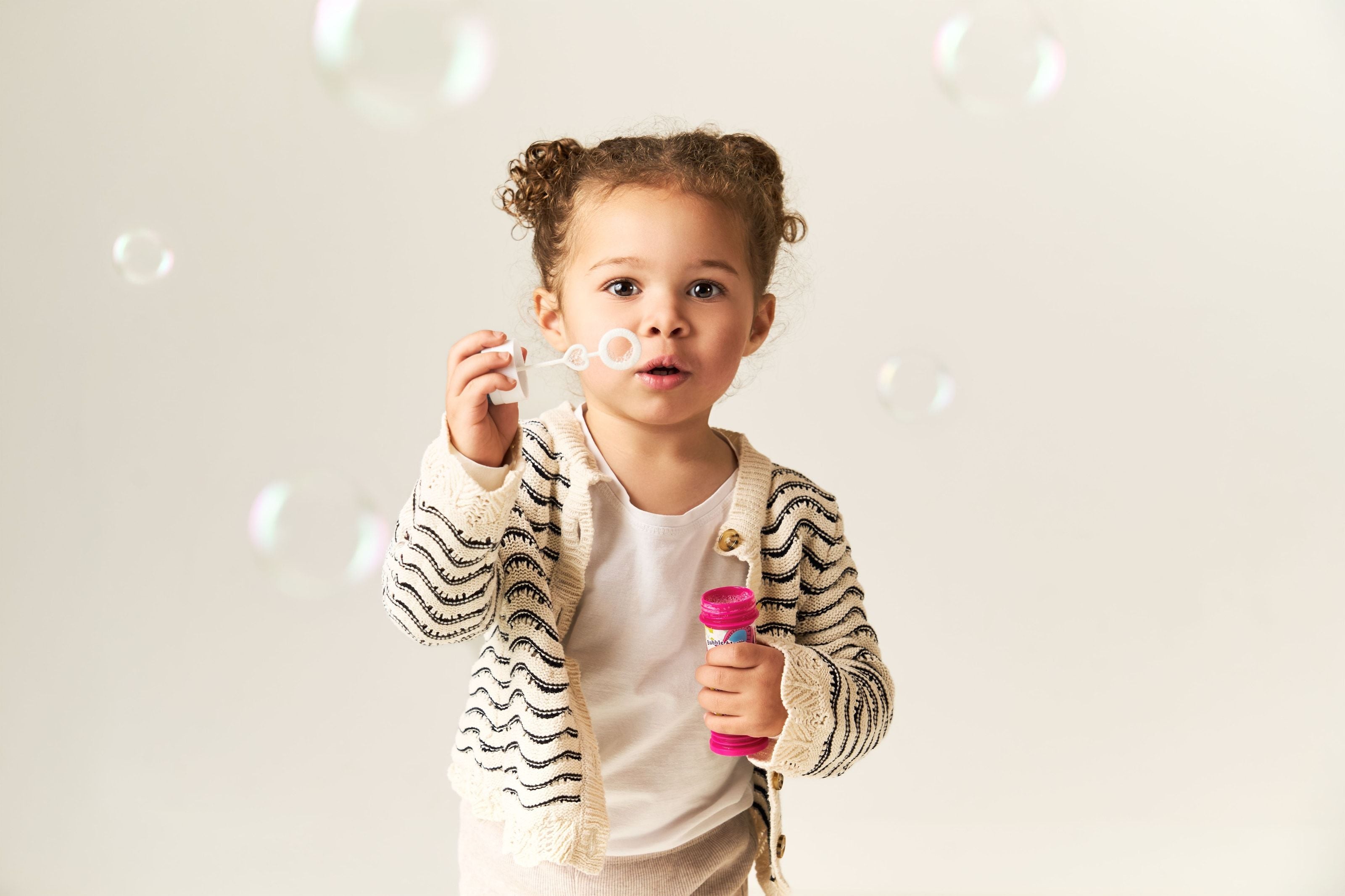
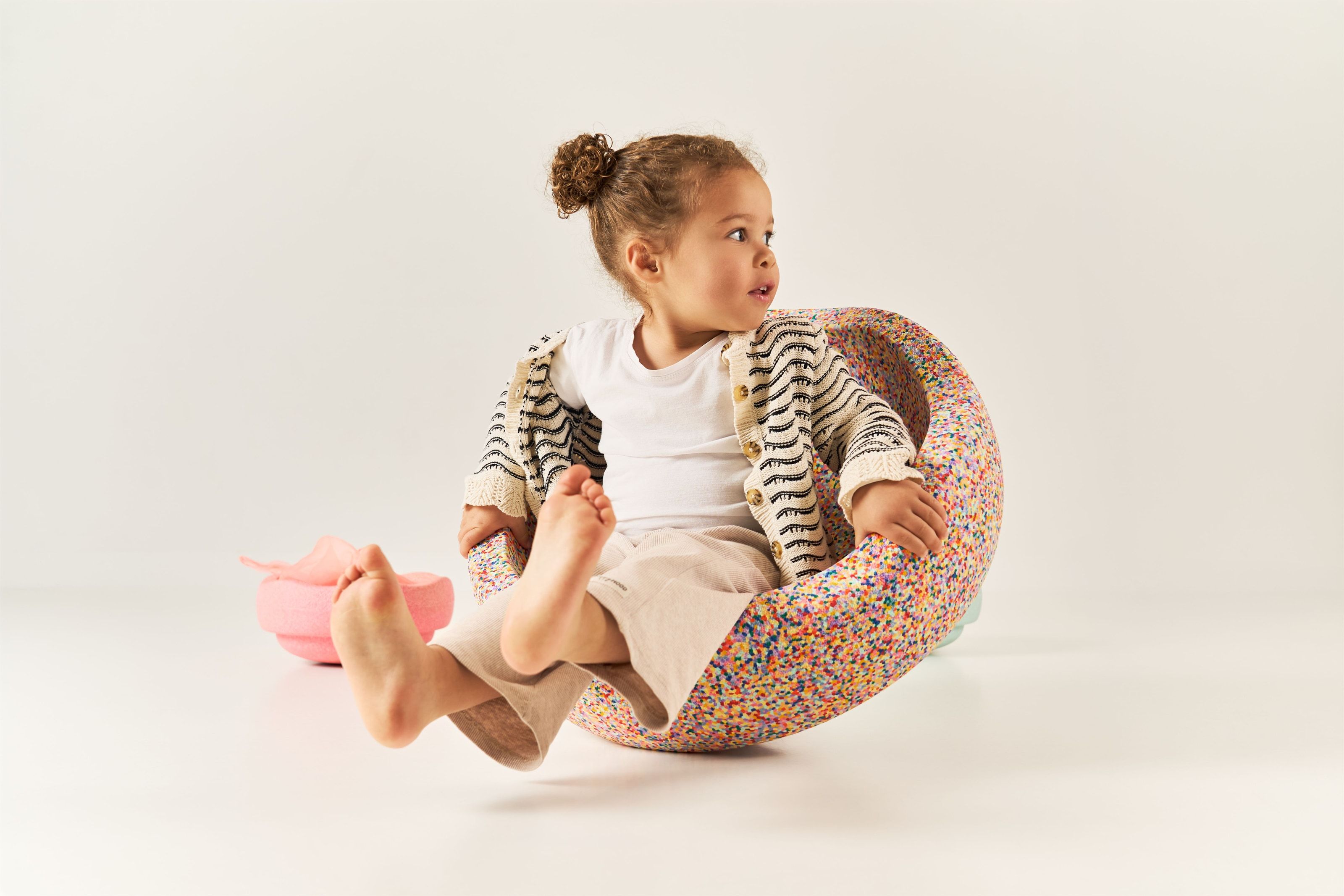
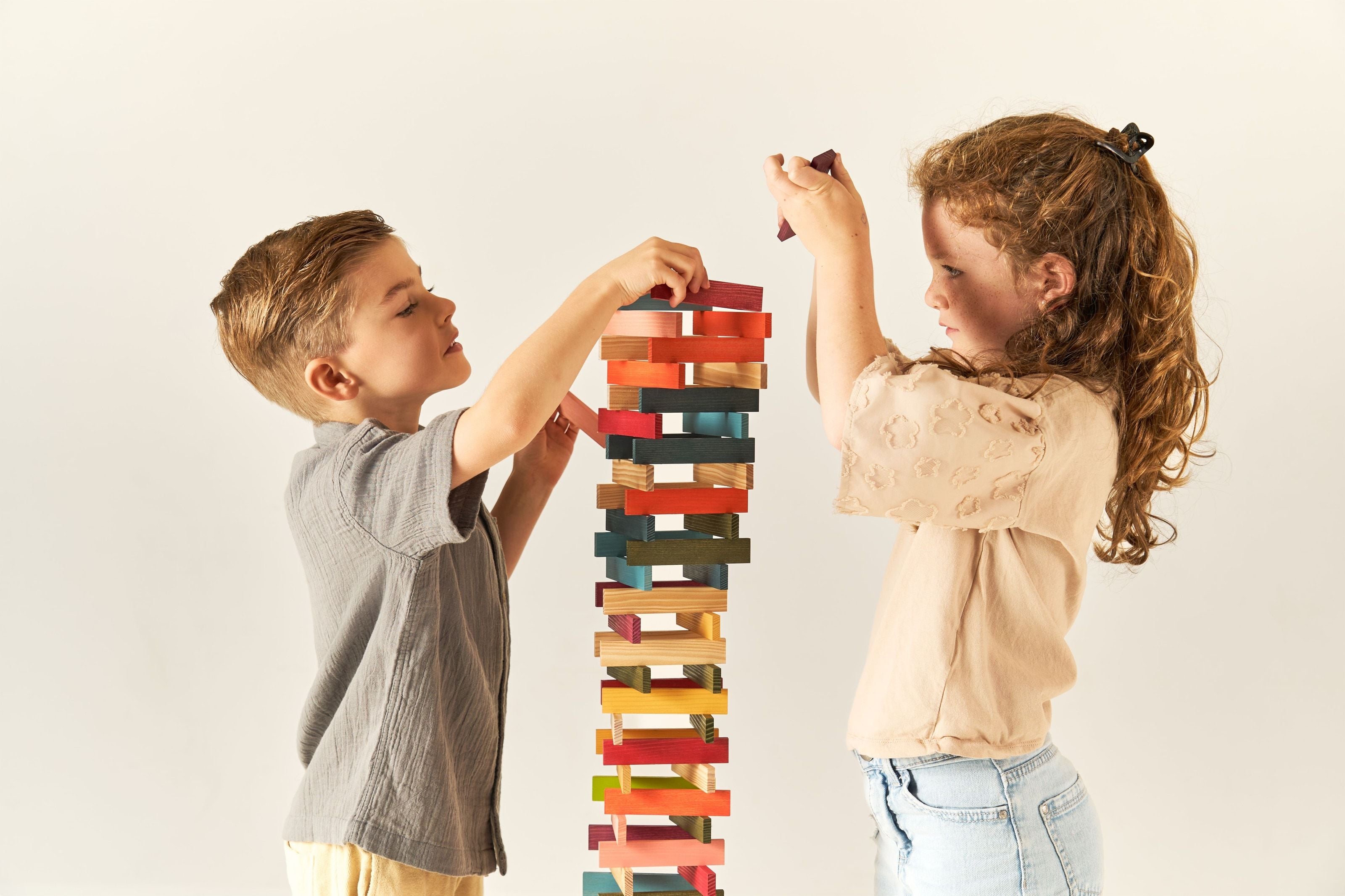
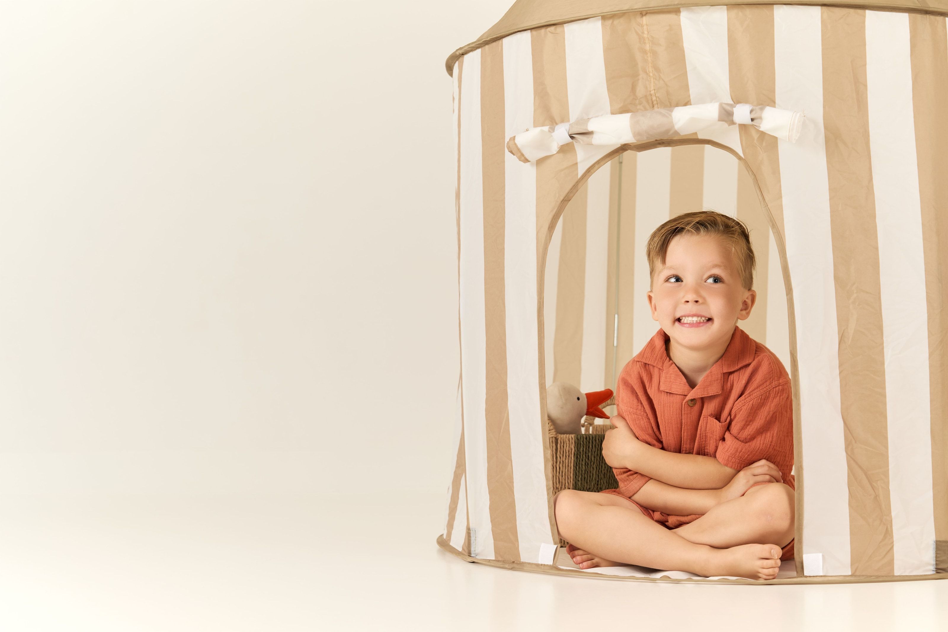
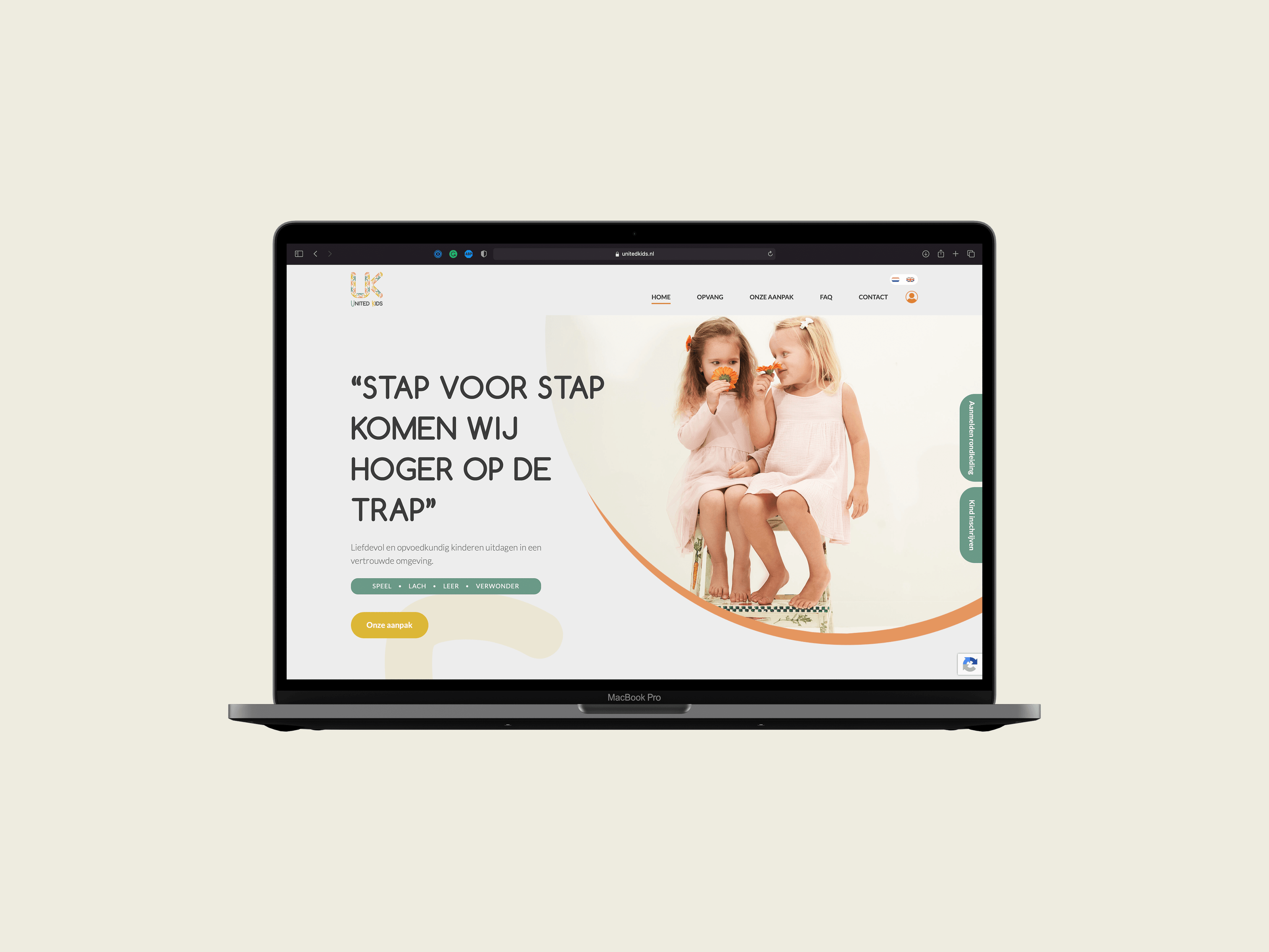
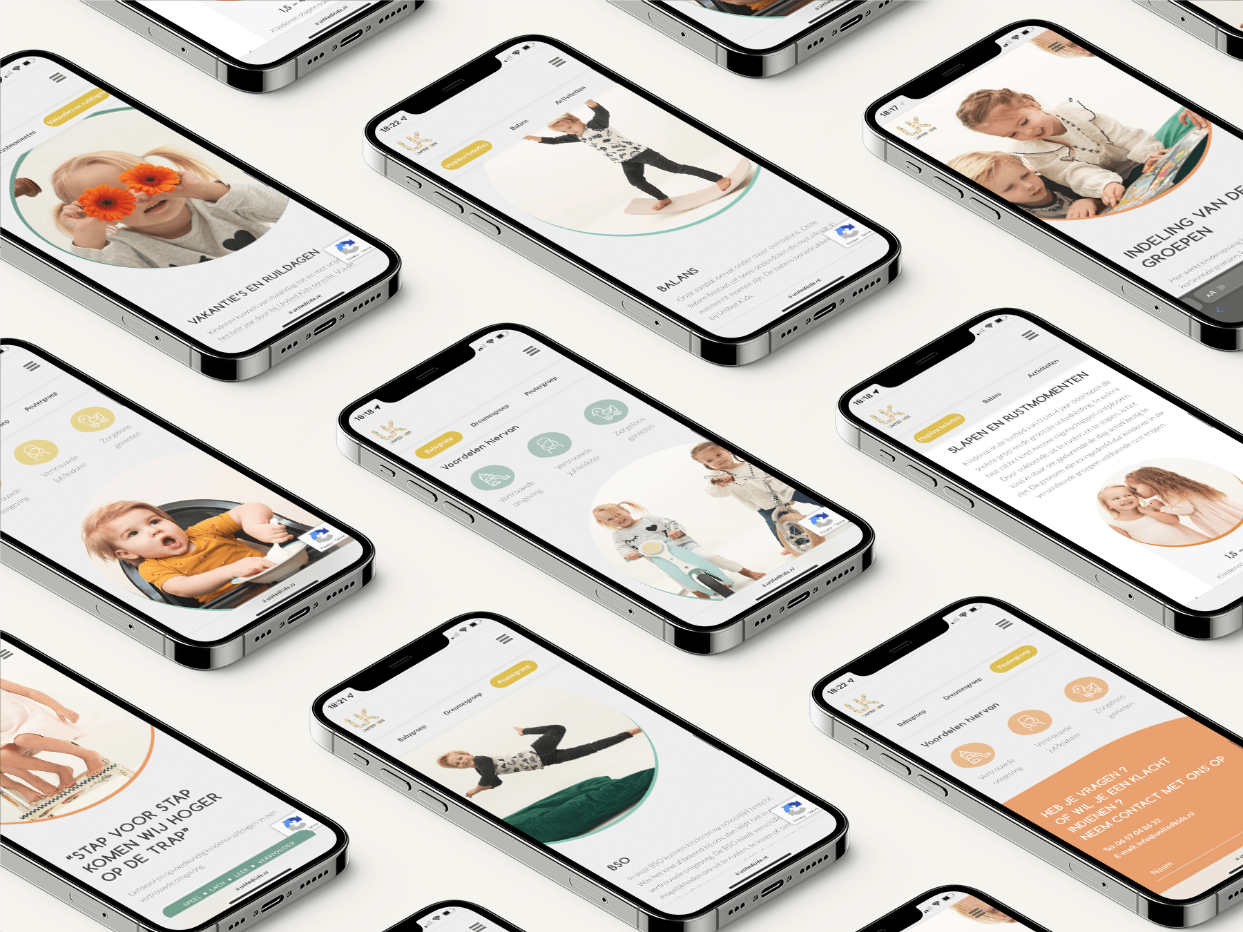
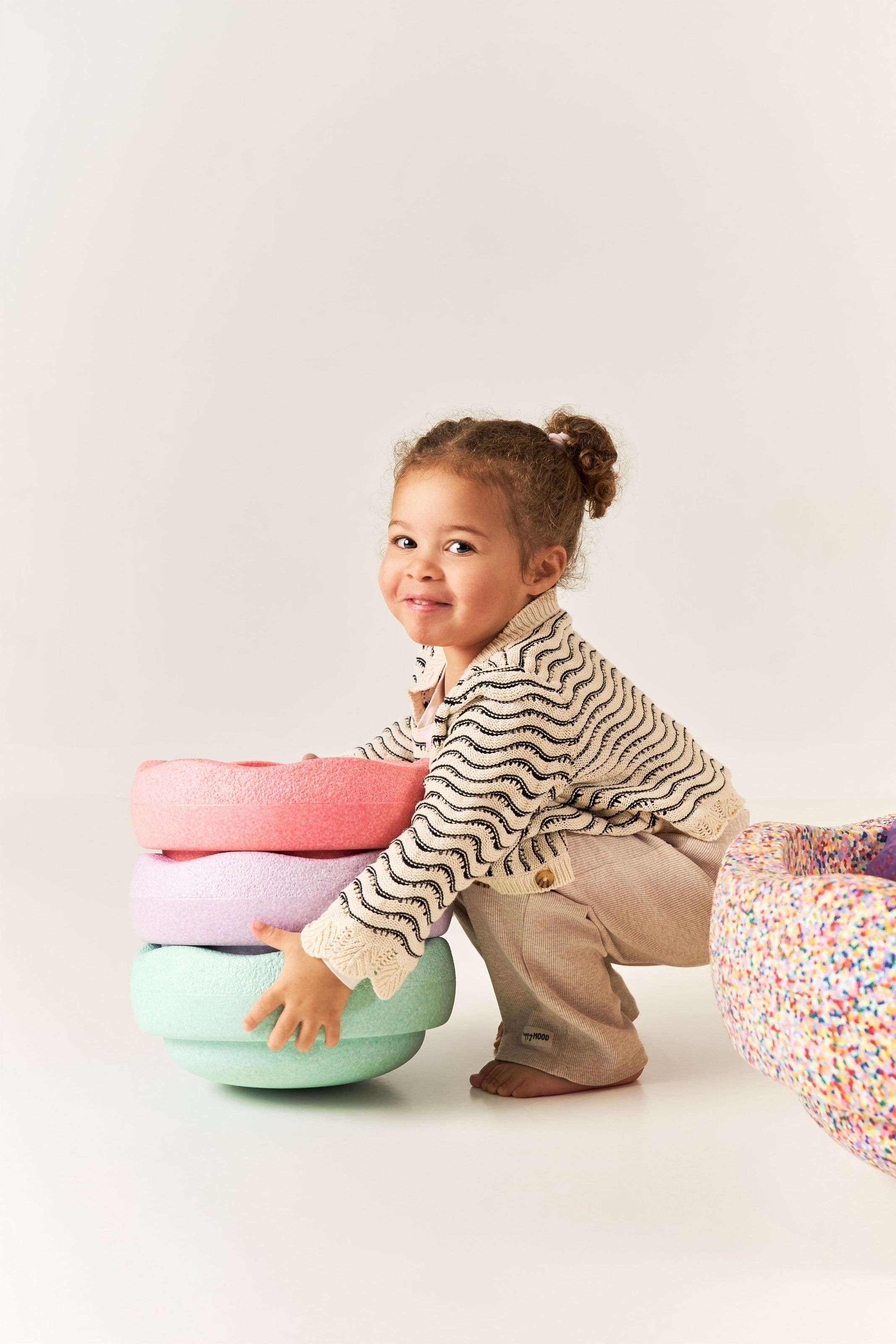
From there the brand book, the website and the print. Then the photography, shot to the styling the book had just set: the same pale light, the same soft palette, children playing rather than posing. Those images went on to carry the print and the site alike.
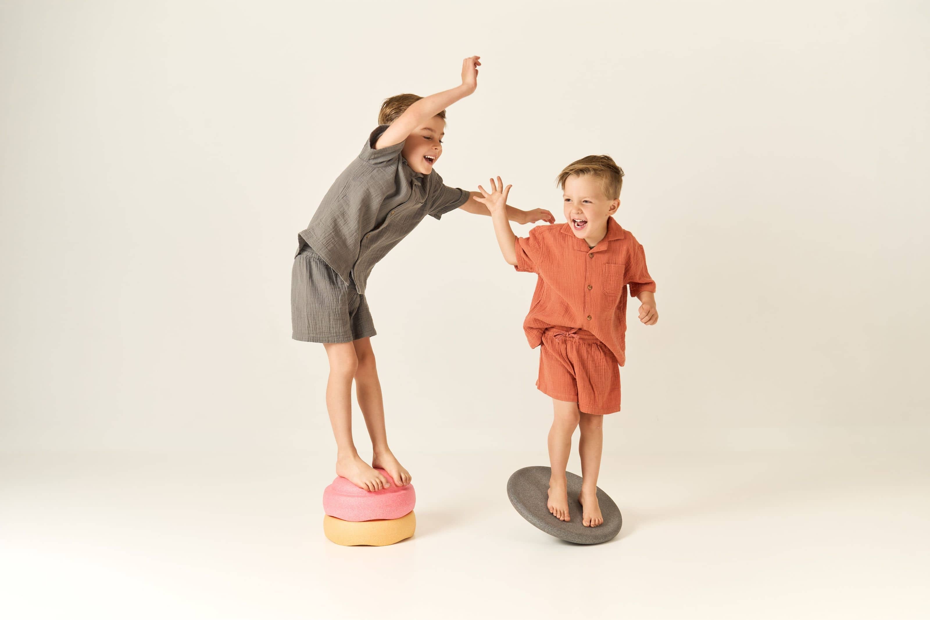
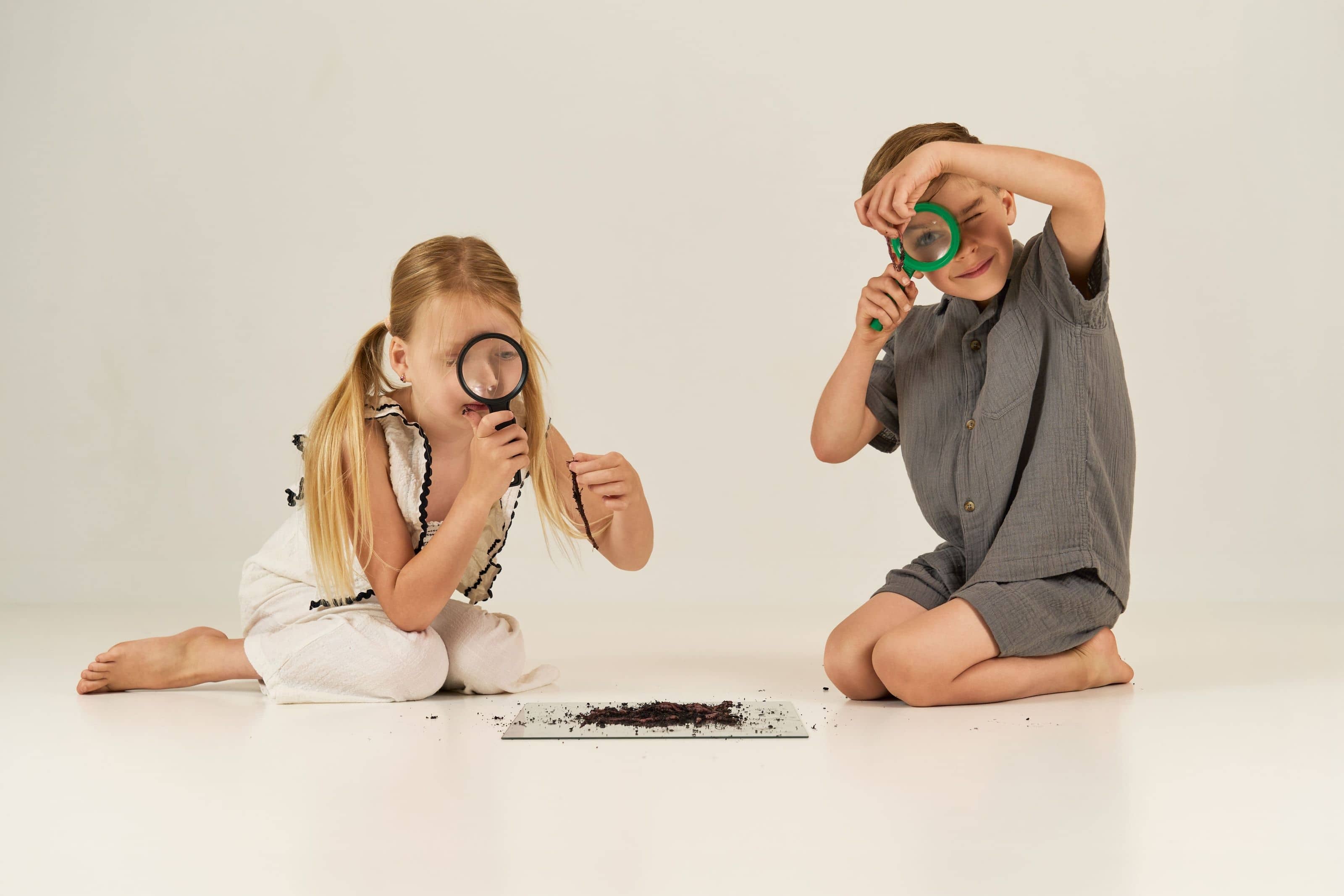
United Kids has run on that identity since the day it opened, and the photography is still doing the work in print and online.
I shot a second set in 2026. A second location is opening now.