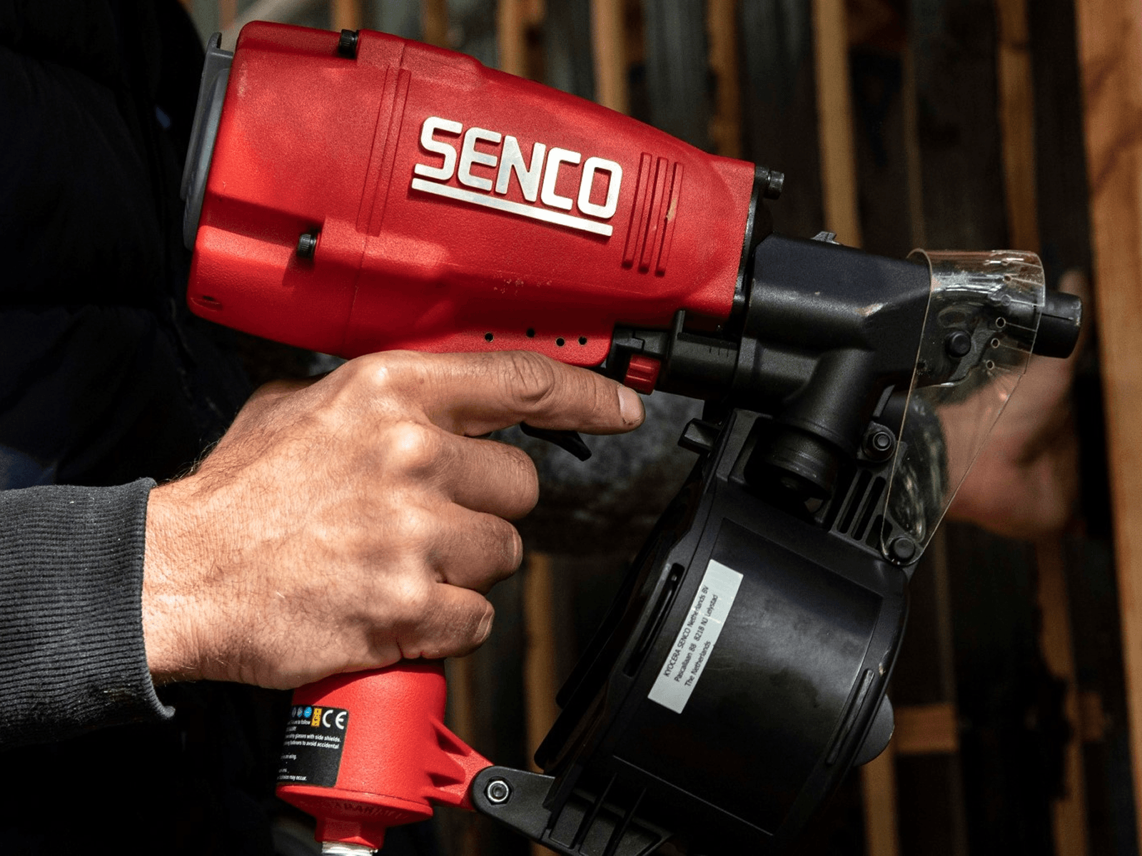
Kyocera Senco makes fastening tools and fasteners for the construction trade - nail guns, screws, collated strip nails - sold mostly through distributors. The brief was a discovery and branding workshop: to find out whether the identity could be taken further.
It covered everything a brand touches, not just one piece of it: a website, print collateral, even an exhibition stand. What came out the other side was a new look for Senco - minimal and direct rather than decorative, built to carry the same red identity across every format it would actually be seen in.
Senco's products are technical and its buyers know exactly what they’re looking for - collation angle, tensile strength, head width. A rebrand that chased polish over that detail would have lost the audience it was for.
The existing identity - red, black, functional - wasn’t broken to begin with. Whatever the workshop produced had to earn its place next to that, rather than simply replace something that worked with something merely different.
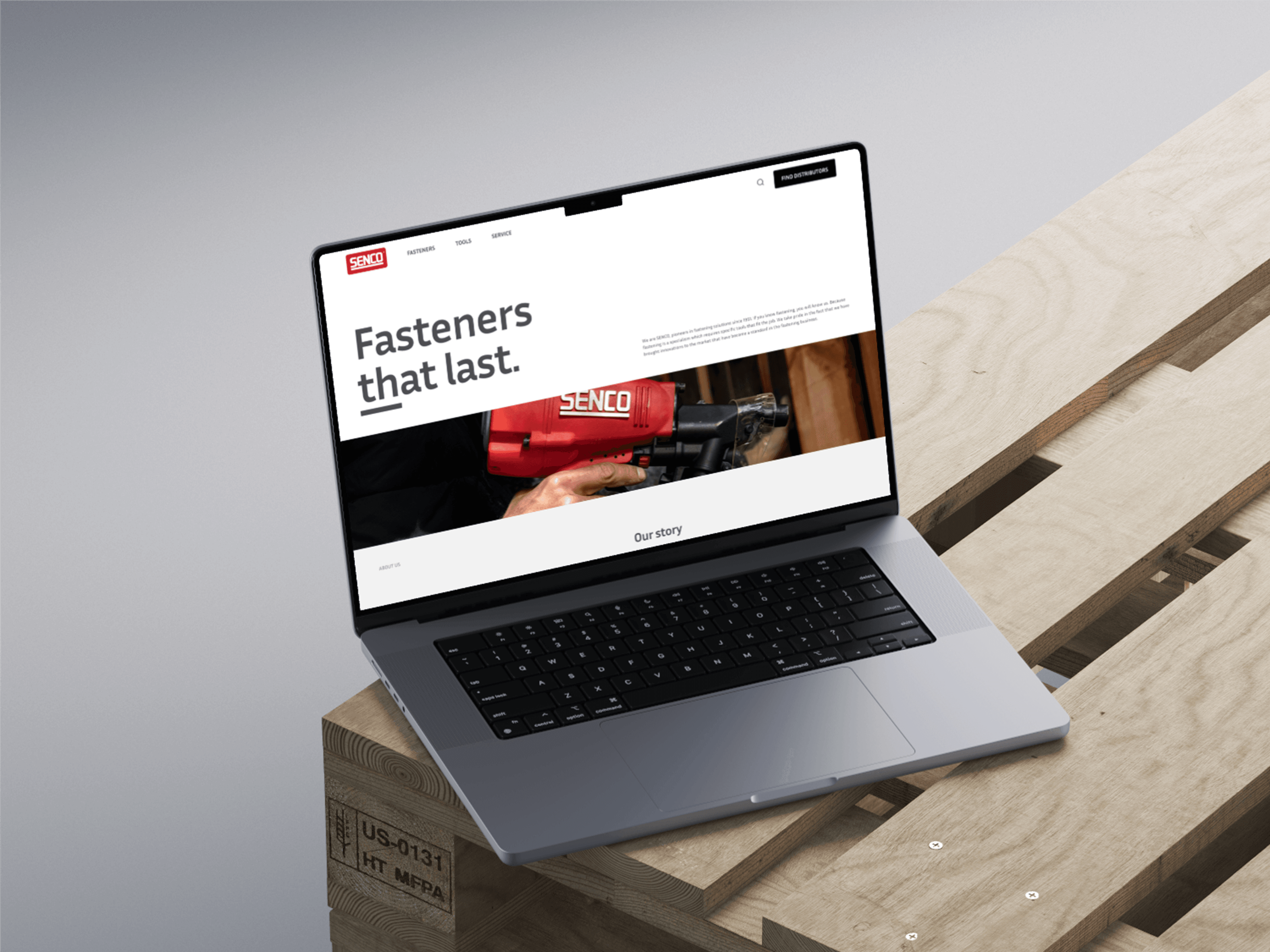
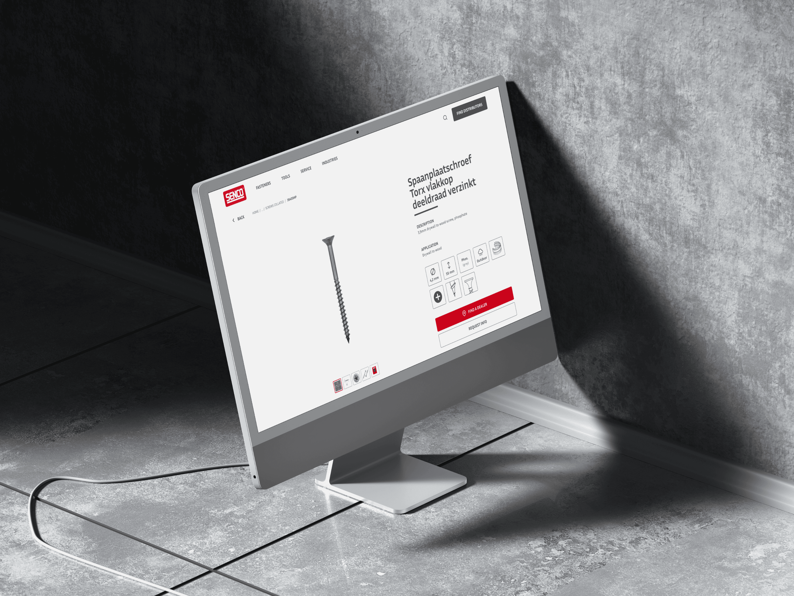
Discovery came before any design work - understanding what Senco's identity already carried, before deciding what to change. The direction that came out of it kept the existing red, but rebuilt the system around it: a plain sans-serif typeface, generous white space, and a consistent grid of icons for specs like diameter, length and coating.
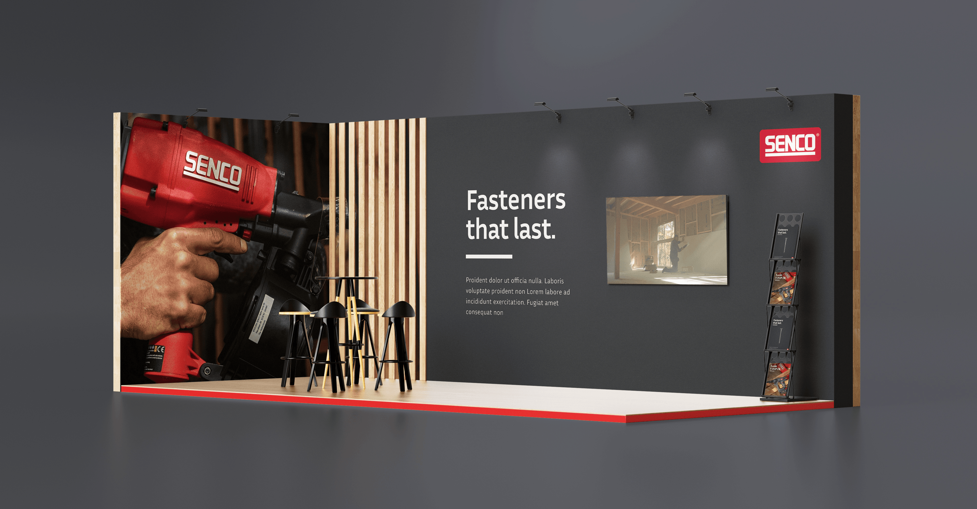
That system was then tested across formats rather than settled on just one: a website concept with a fastener catalogue and product pages, a brochure and a technical data sheet for print, and a full exhibition stand design - all carrying the same look and the same line, ‘Fasteners that last.’
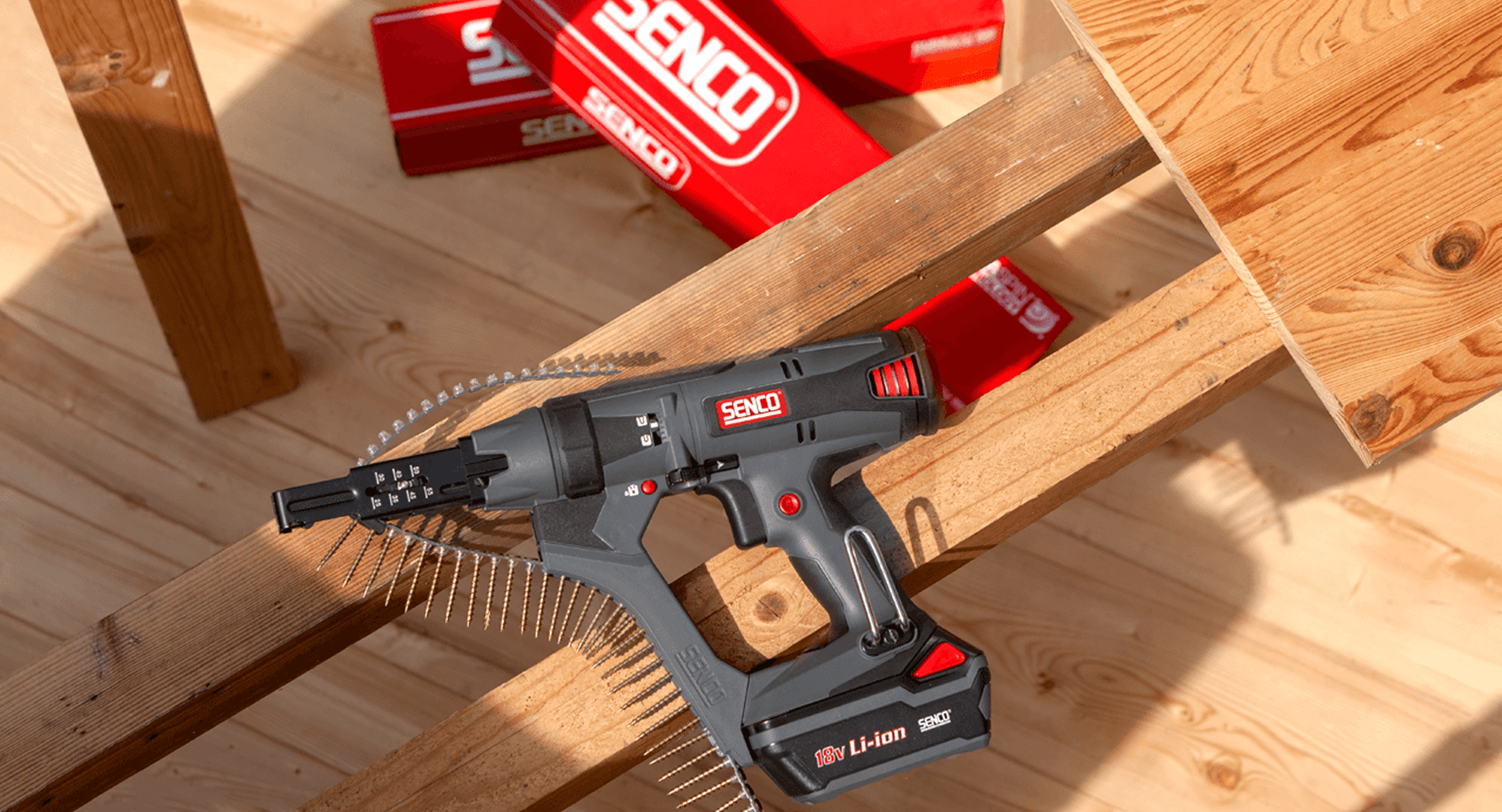
We had the freedom to explore a lot ourselves, while knowing there were experienced people to fall back on when things got more complex. That combination of independence and guidance worked really well for us.
Casper Veltman, Digital Project Manager EMEA, Kyocera SENCO
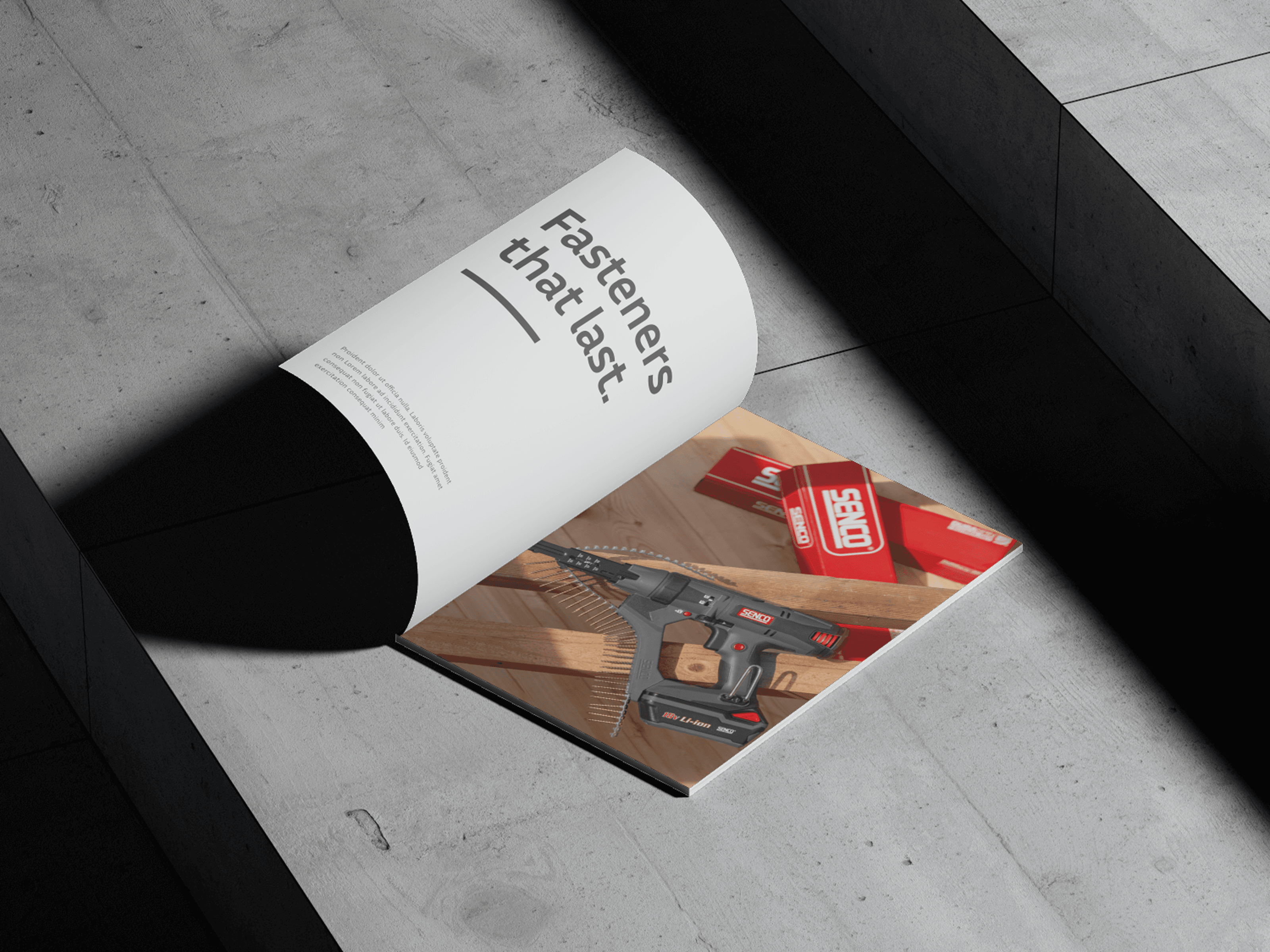
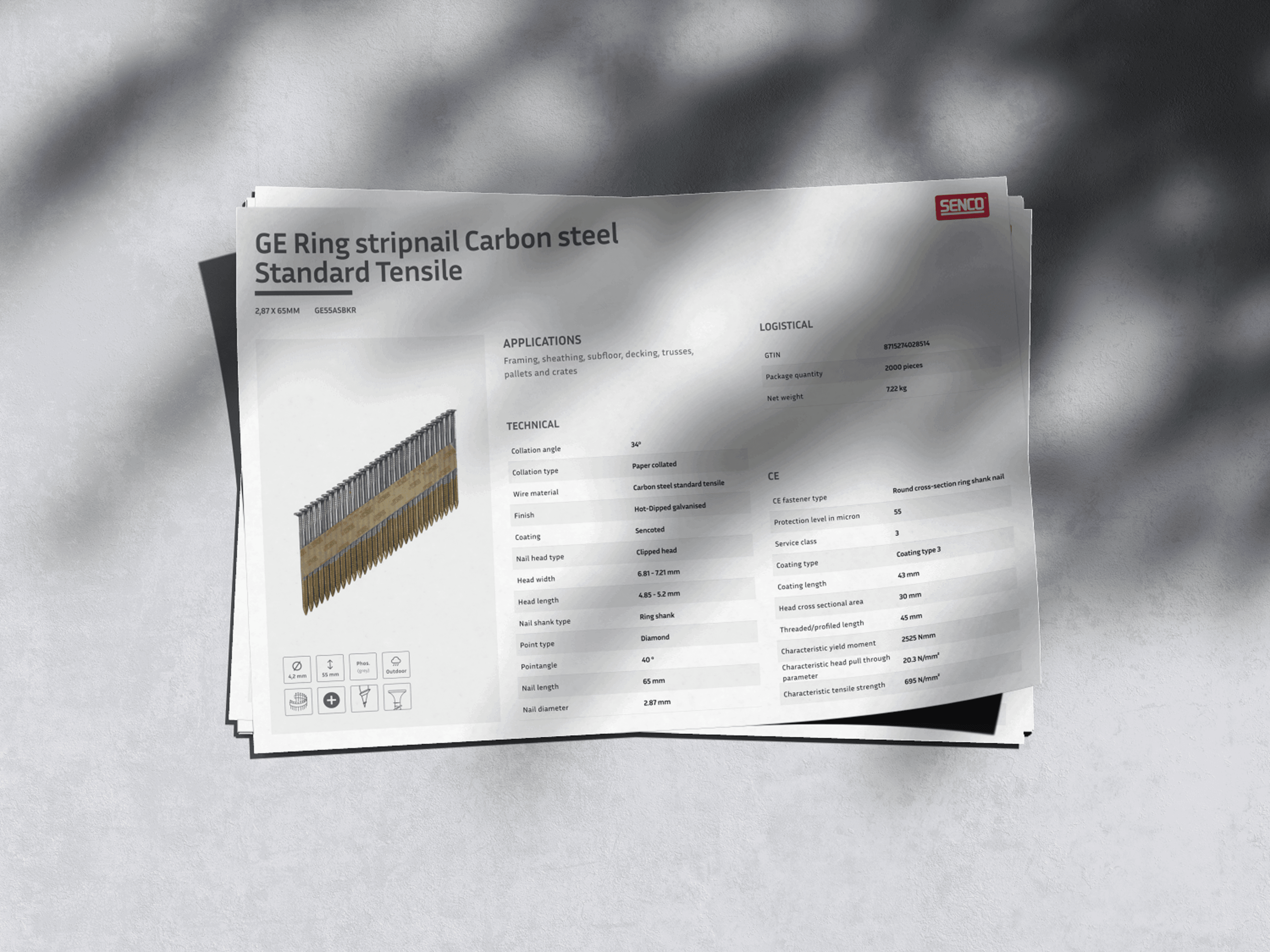
What came out of the workshop was one system, not a set of separate ideas - the same red, the same type, the same icon language, carried consistently from a website through print to a physical stand.
Whether it goes further than the workshop is Kyocera Senco's call. What it delivered was proof that the existing brand had room to become sharper without losing what already made it recognisable.