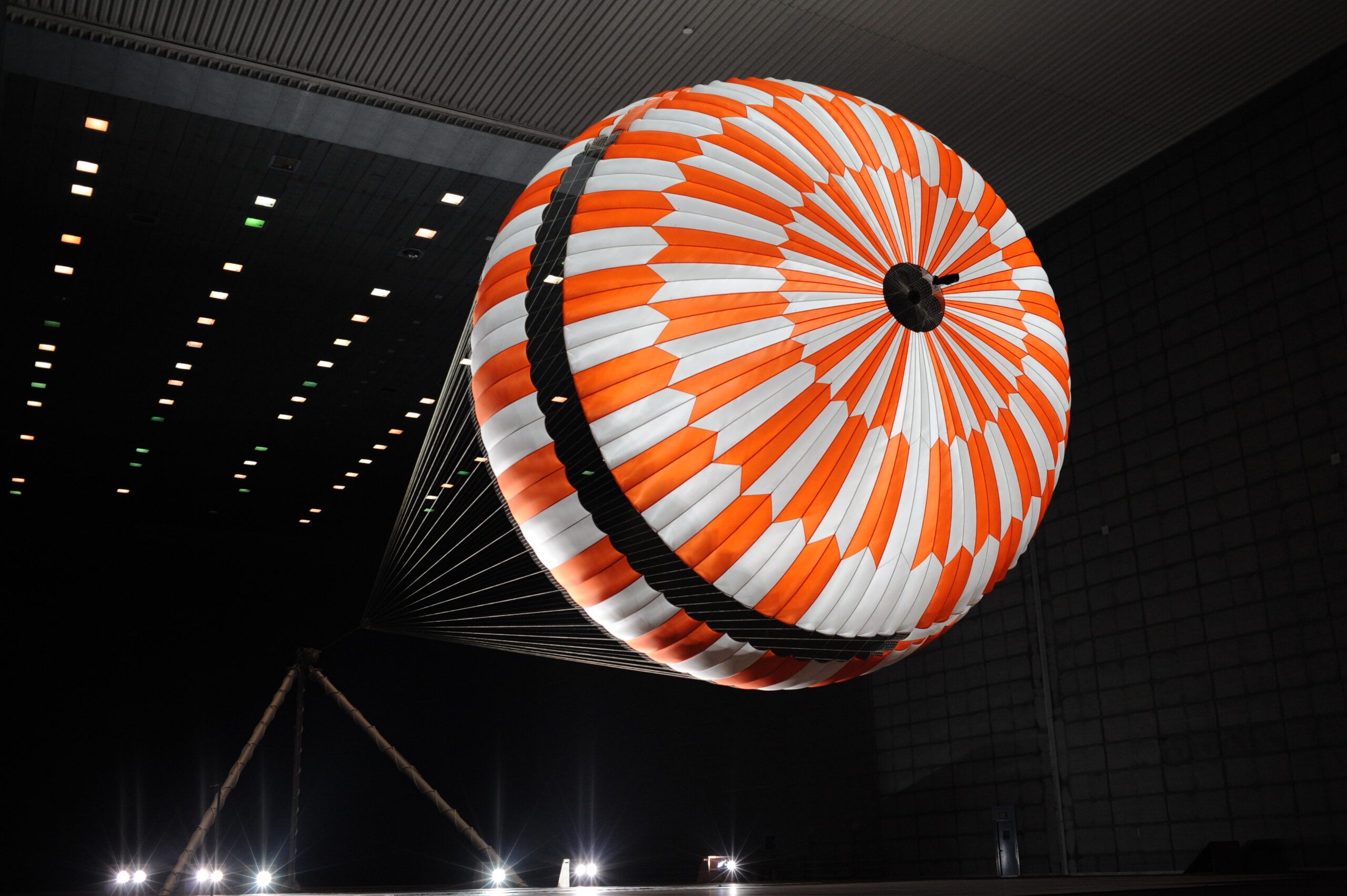
Teijin Aramid makes the aramid fibres - Twaron, Technora, Teijinconex among them - that end up in things far removed from each other: body armour, tyres, undersea cable, a parachute suspension line on its way to Mars. The company had just been through a rebrand when the site itself came up for a complete overhaul, UX and UI both.
Discovery came first, and it stayed open longer than most: was this site a portfolio, a shop, or a tool - and did the new brand, and the technology under it, actually support whichever it turned out to be. I worked the plan and the architecture that came out of that with the team, then took the UI.
A material this varied resists one website. What an aerospace engineer needs from the site and what a body-armour buyer needs are close to opposite, and a rebrand doesn’t answer that question - it only gives the answer better clothes.
So the harder work came first, before any screen: deciding what the site actually was for. A portfolio that shows the work, a shop that sells it, a tool that specs it - each is a different site, and picking wrong would have looked fine at launch and failed a year in.
Discovery ran on all of it at once: what the business needed the site to do, what it should look and feel like now the brand had changed, and whether the technology underneath could actually carry that out. None of those questions had an obvious answer going in.
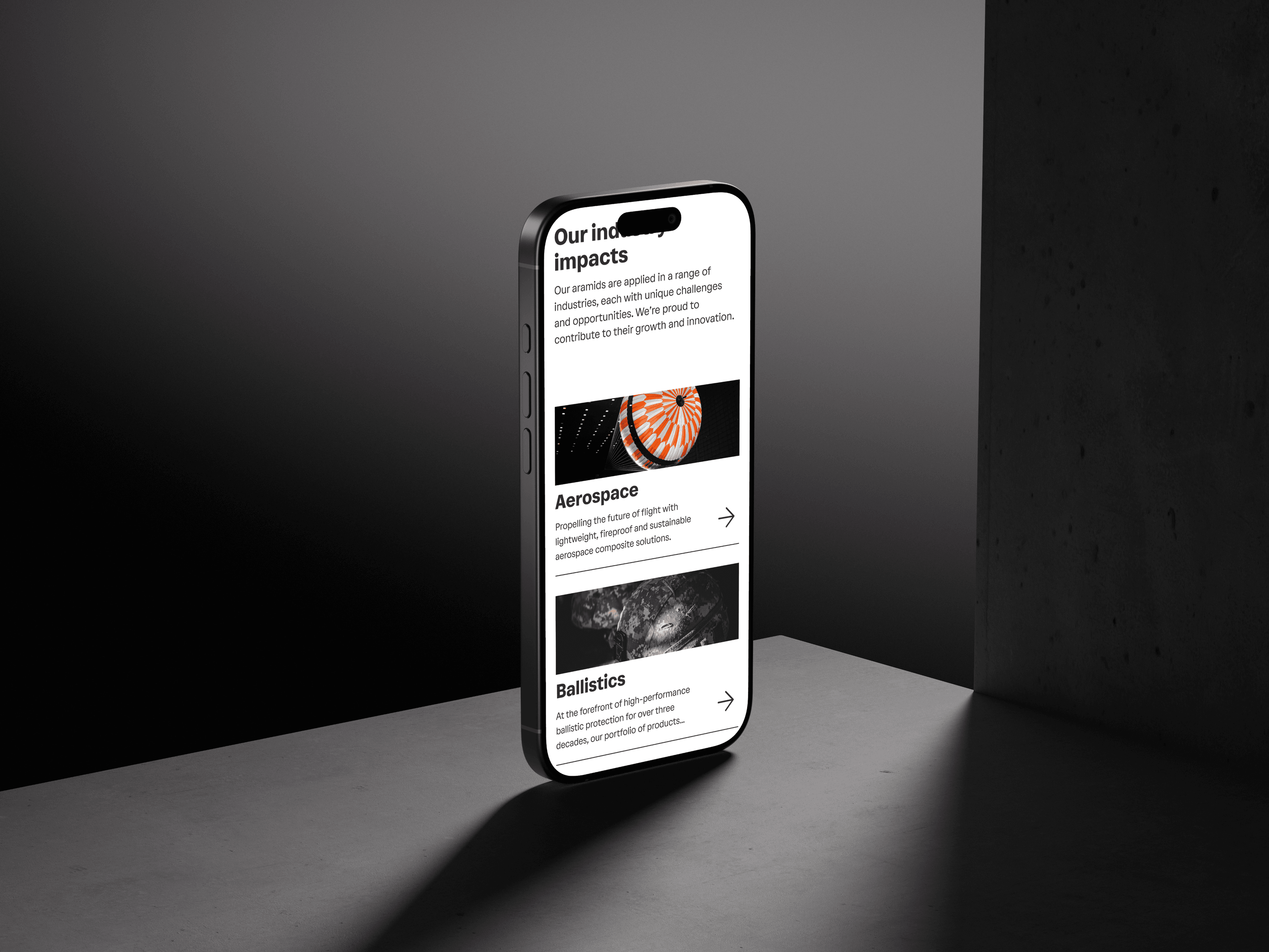
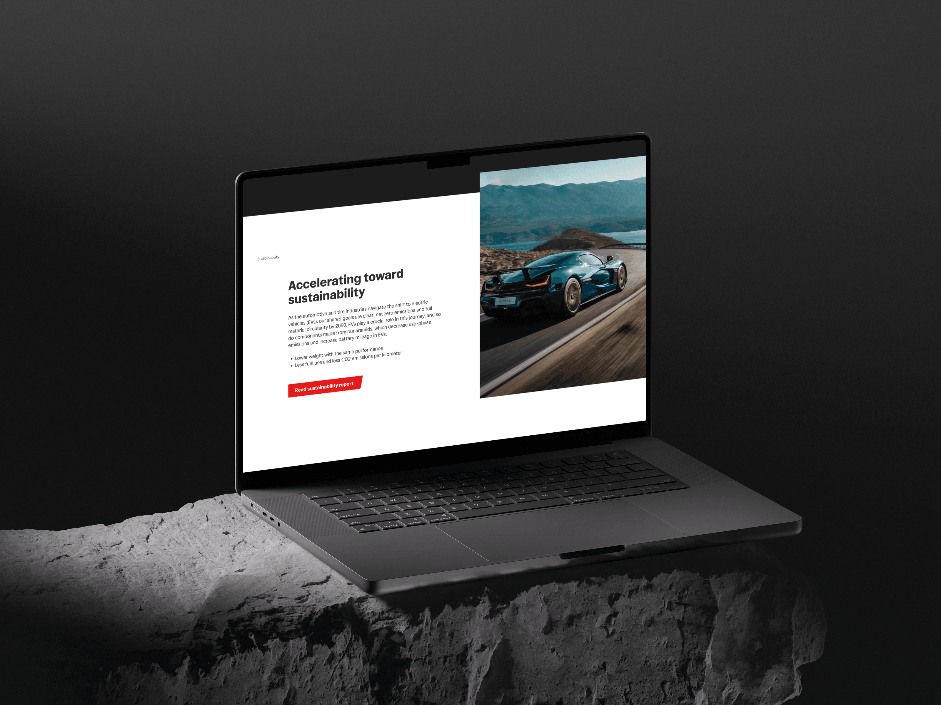
Out of that came a plan, then a flow and an architecture built to it - the site’s actual shape, industry by industry, product by product. I took the UI from there: the dark, editorial homepage; product pages that let a real photograph carry the material’s performance rather than a spec sheet; a sustainability page built to be read rather than skimmed.
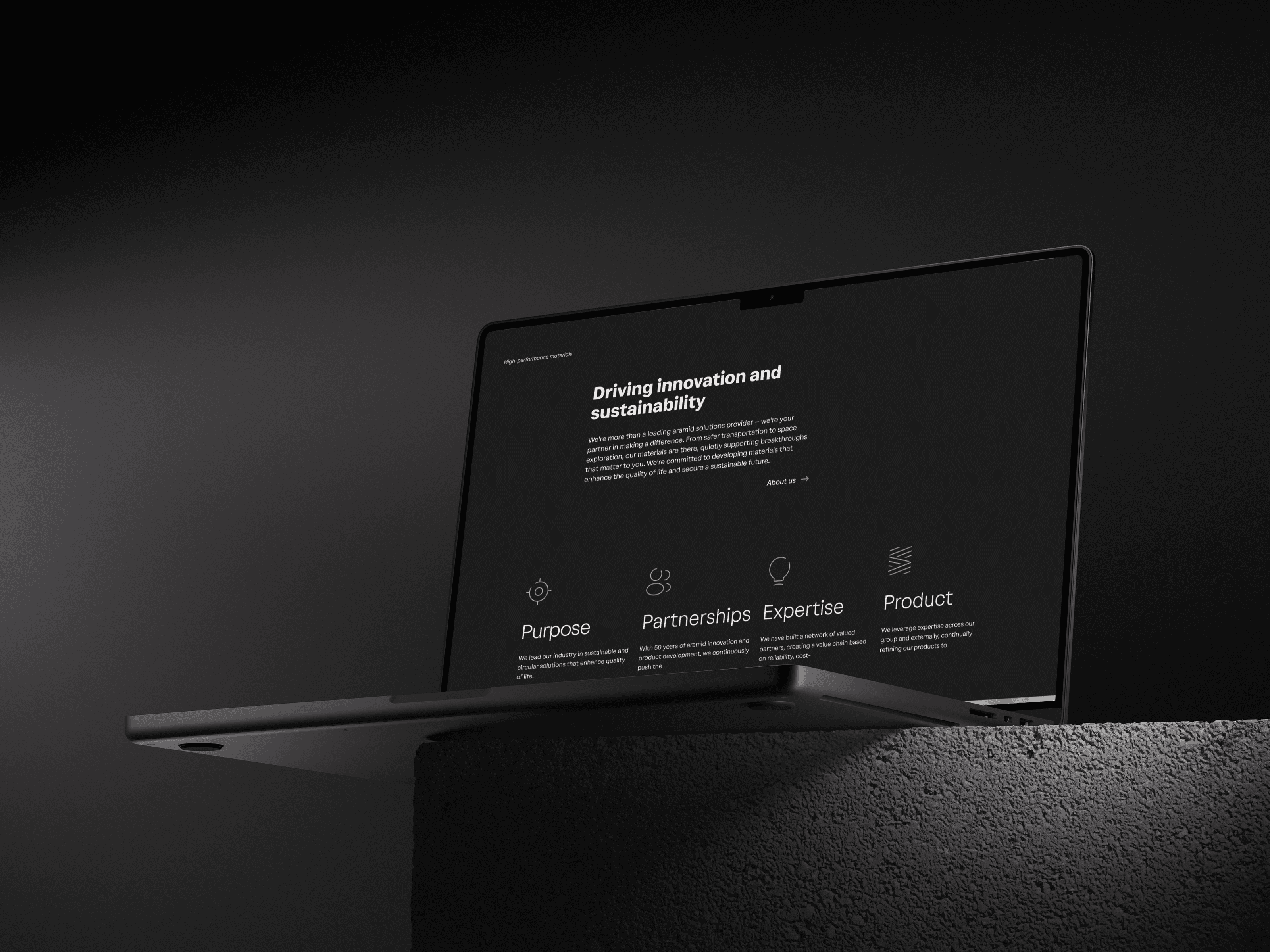
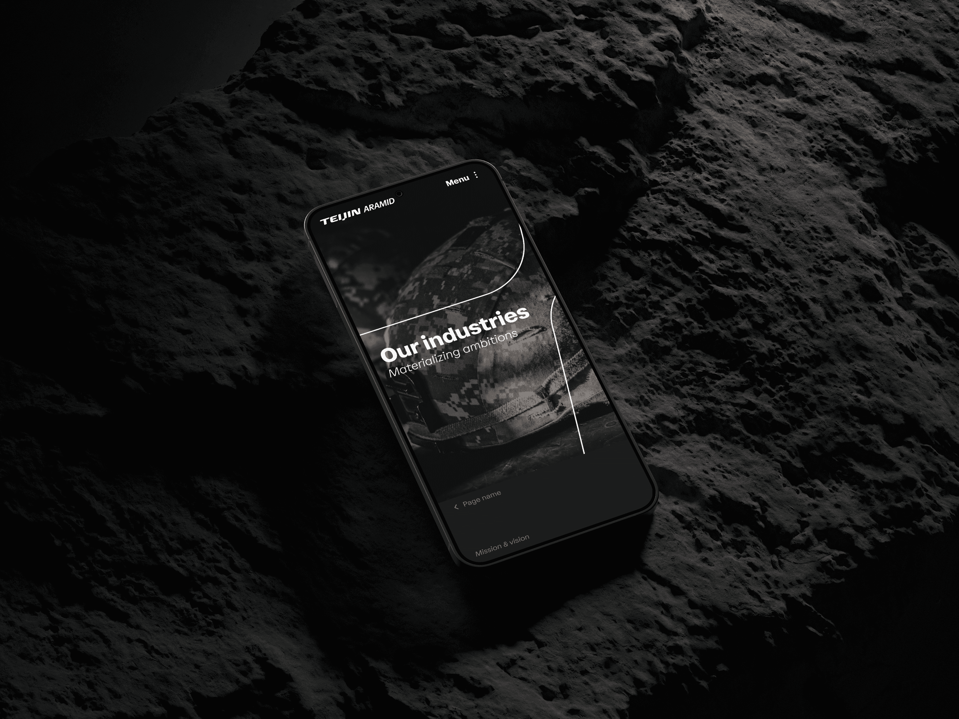
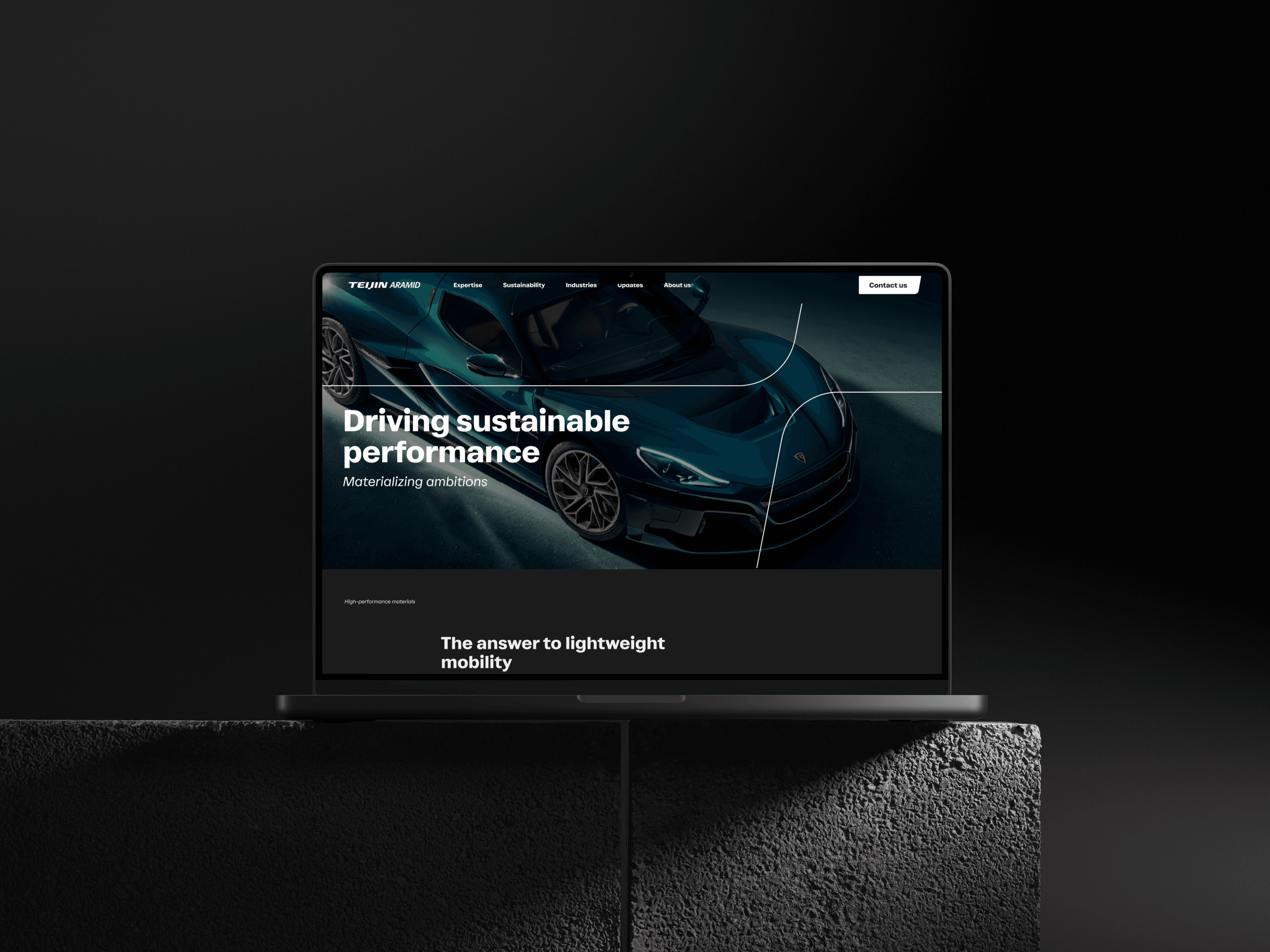
The rebuild reaches across the company’s range - the homepage, product pages, the sustainability report, industries from aerospace to ballistics - on the architecture the discovery phase set out to find.