A design system isn’t a component library. It’s an agreement between brand, design and engineering about how things get built.
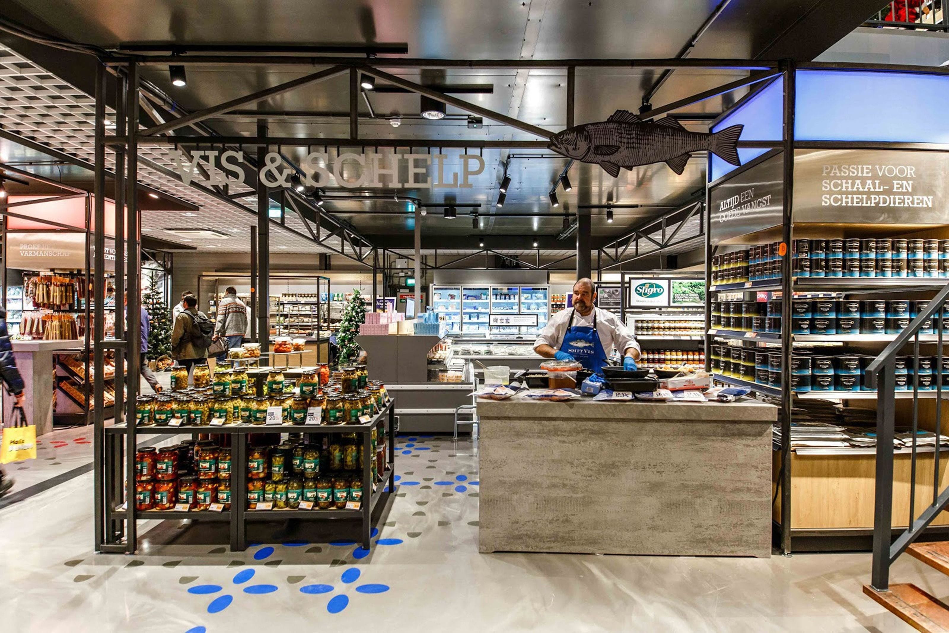
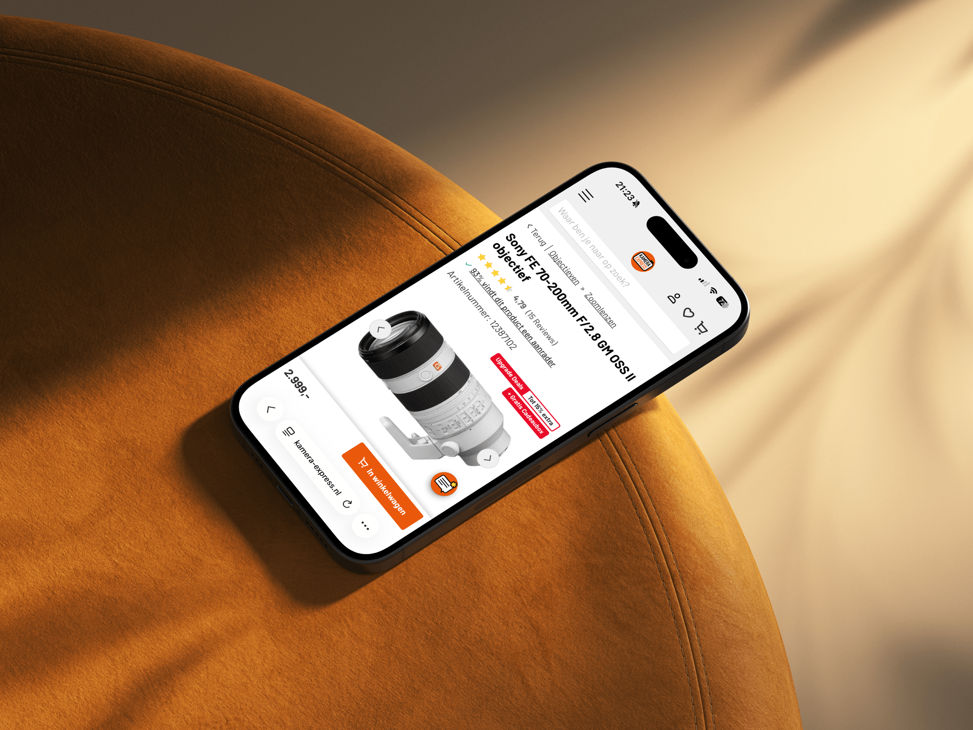
Tokens first: colour, type and spacing held as values rather than as decisions repeated by hand. Sligro Food Group trades under six names - Sligro, De Kweker, Aan Tafel, Sligro-M, van Hoeckel and Java - and runs them off one tokenised system, where a brand is a set of values rather than a separate set of screens. My Jewellery and Kamera Express were the same problem at a different scale: a shop that had drifted out of step with itself over years of additions. What decides whether a system lasts is not the component library. It is the naming, the documentation, and who is allowed to add to it.
A system is a product with users of its own: designers, developers and marketers. I treat their adoption as the success metric, which means naming, documentation and governance matter as much as the components themselves.
Four steps, run in short loops rather than one long waterfall.
- 01
Audit
Every existing screen, component and colour collected in one place. Seeing forty shades of grey next to each other is usually the most persuasive argument a project ever gets.
- 02
Architect
Token layers, naming conventions and theming decided before any component is drawn. This is the part that determines whether the system survives its second year.
- 03
Build
Figma library and coded components developed in parallel, same names, same props, same behaviour, so design and code cannot drift apart unnoticed.
- 04
Adopt
Documentation, onboarding sessions, a contribution model and a release rhythm. A system nobody knows how to contribute to is a system that quietly dies.
A system succeeds when the second team ships faster than the first. I design tokens, components and documentation as one product, together with the developers who will live in it.
At Sligro that meant one tokenised foundation serving six trading names, so that a brand became a set of values rather than a separate set of screens.


Not every project needs all of it. These are the parts.
Colour, type, spacing and radius decisions captured as named tokens with theming built in: the single source every component and brand variant draws from. The naming layer is the part that decides whether the system lasts, so it gets designed as carefully as any interface. Change a token and the decision travels through every product at once.
Figma libraries and coded components kept in lockstep: same names, same props, same behaviour, so design and engineering never drift apart. I build both sides in parallel with the developers who will own them, which surfaces the awkward cases early, while they are still cheap to solve.
Usage guidance, do’s and don’ts and live examples written for the people who build with the system: short enough to read, complete enough to trust. Documentation covers the decisions as well as the components, because most questions are about when to use something, not how it looks.
Contribution models, versioning and release rhythms that keep the system alive, plus onboarding that turns sceptical teams into contributors. A library nobody knows how to extend becomes a bottleneck within a year. Governance, ownership and a clear path for proposals prevent that from the start.