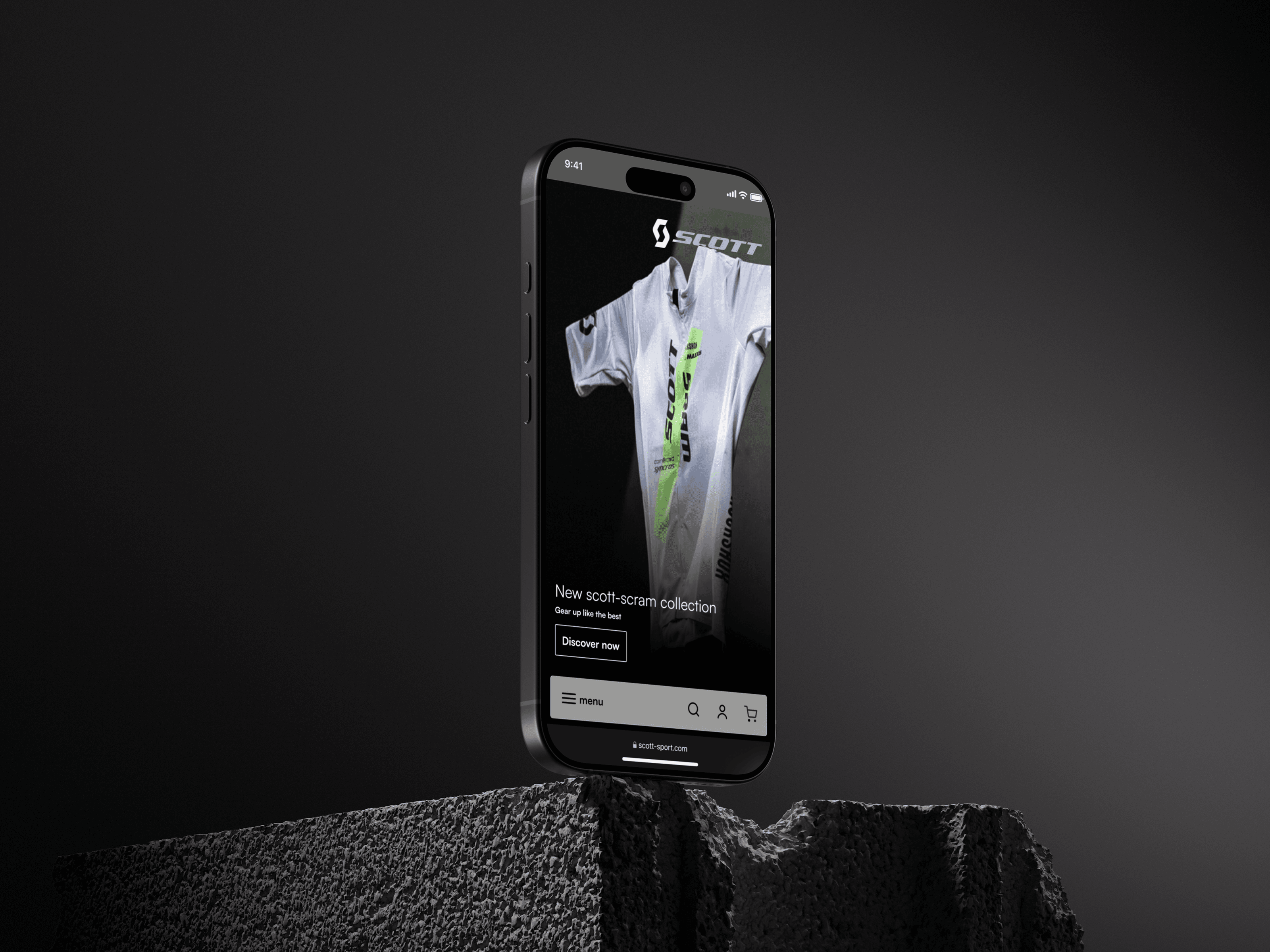
Scott Sports makes bikes, ski equipment and running kit, and sells most of it through local distributors. Those distributors hold the relationship with the customer, which leaves the brand itself at a remove from the people who actually ride and race on it.
The brief was narrower than usual: a design proposal for the online platform. A colleague took the experience, I took the interface, and what we handed over was a clickable prototype.
A platform that knows nothing about the person using it has to treat everybody the same, and Scott’s customers aren’t the same. A first-time buyer and a racer want opposite things from the same page - one needs to be told what a thing is for, the other already knows and wants the numbers.
And a relationship the distributors currently hold isn’t won back by selling harder. The platform has to be worth coming to directly.
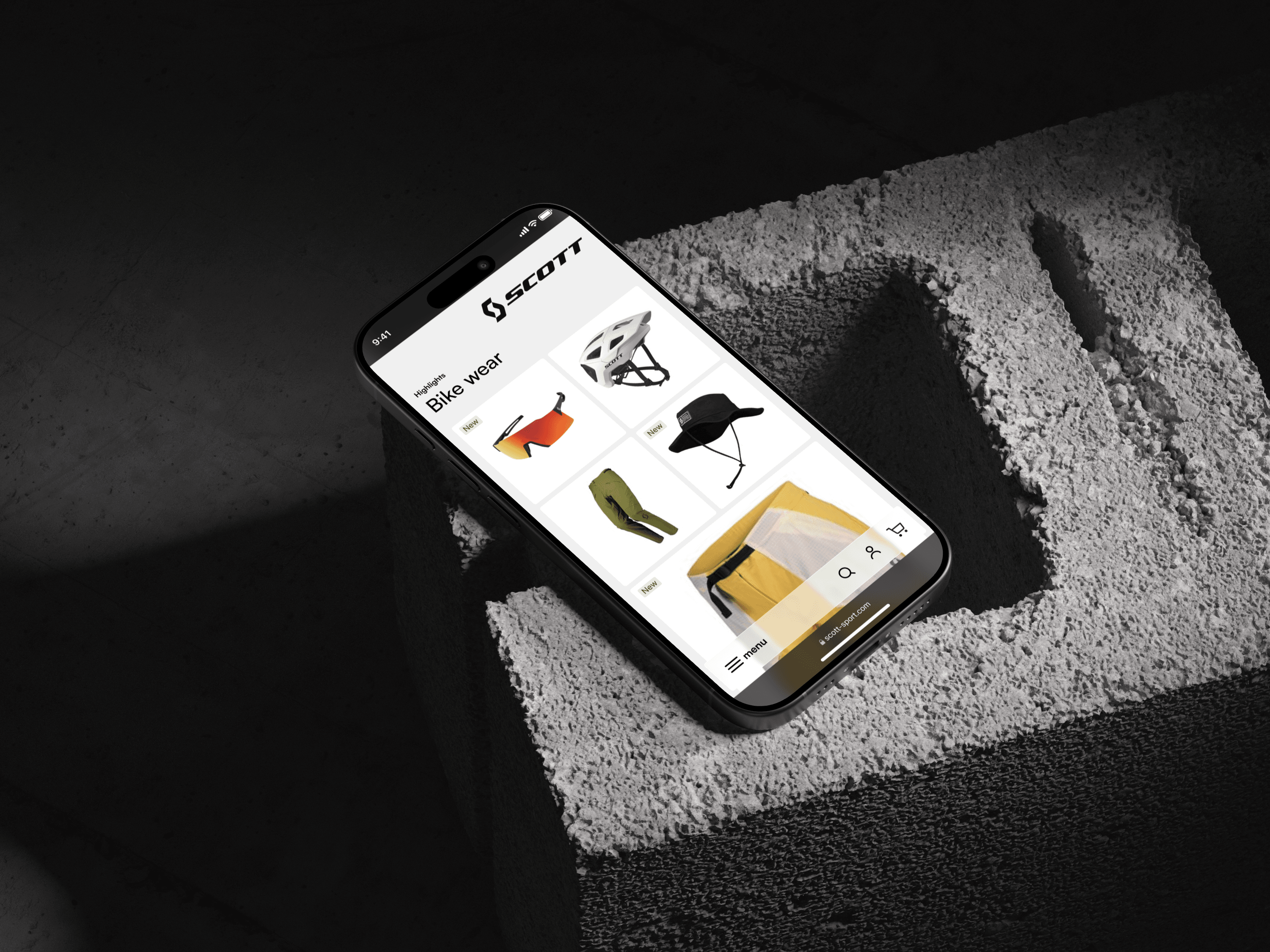
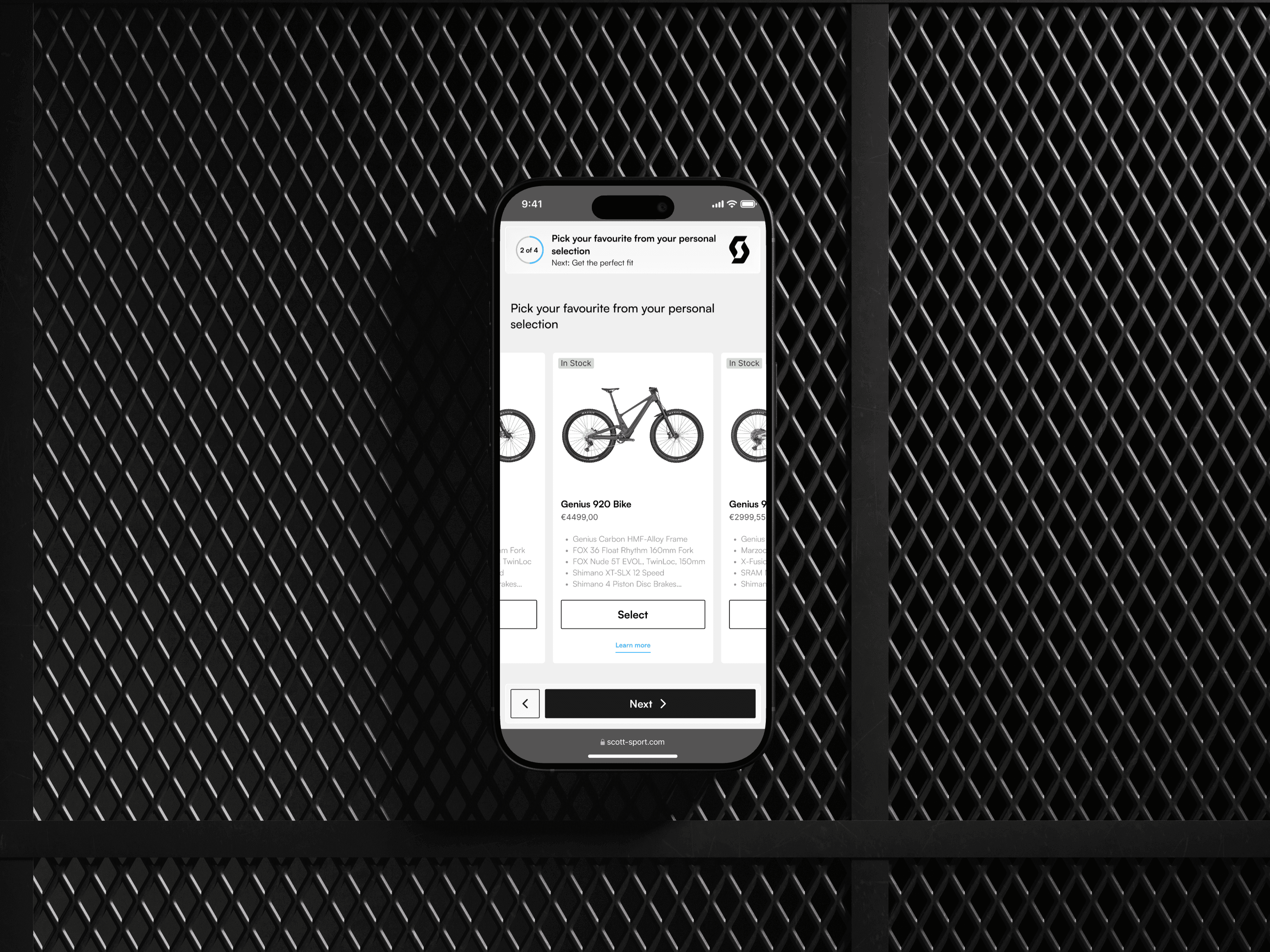
The entry was built around the person instead of the catalogue. You say what you are - beginner, expert, outdoor, moto - or take a short quiz if you’d rather not decide, and the platform opens on your part of it rather than all of it.
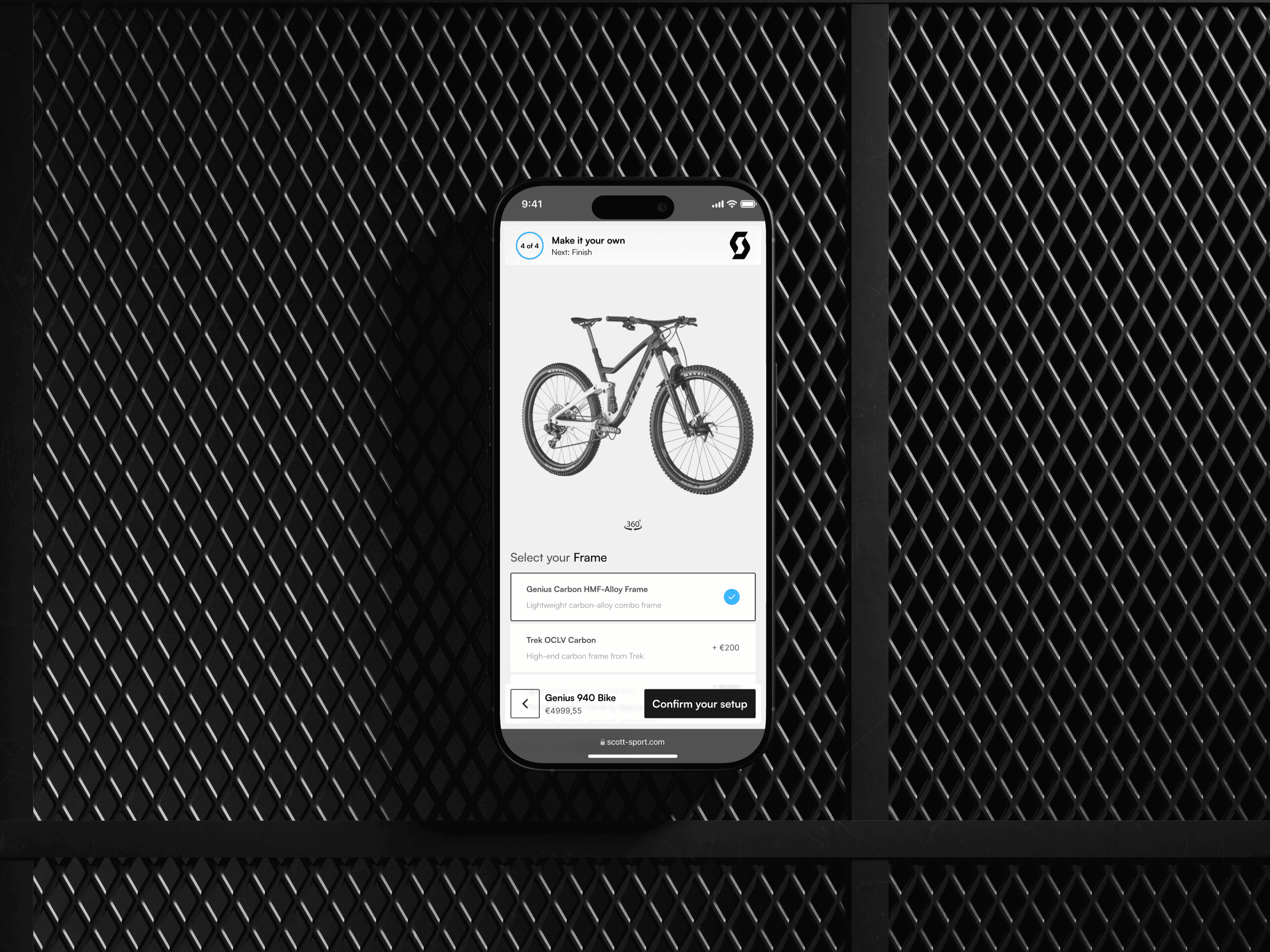
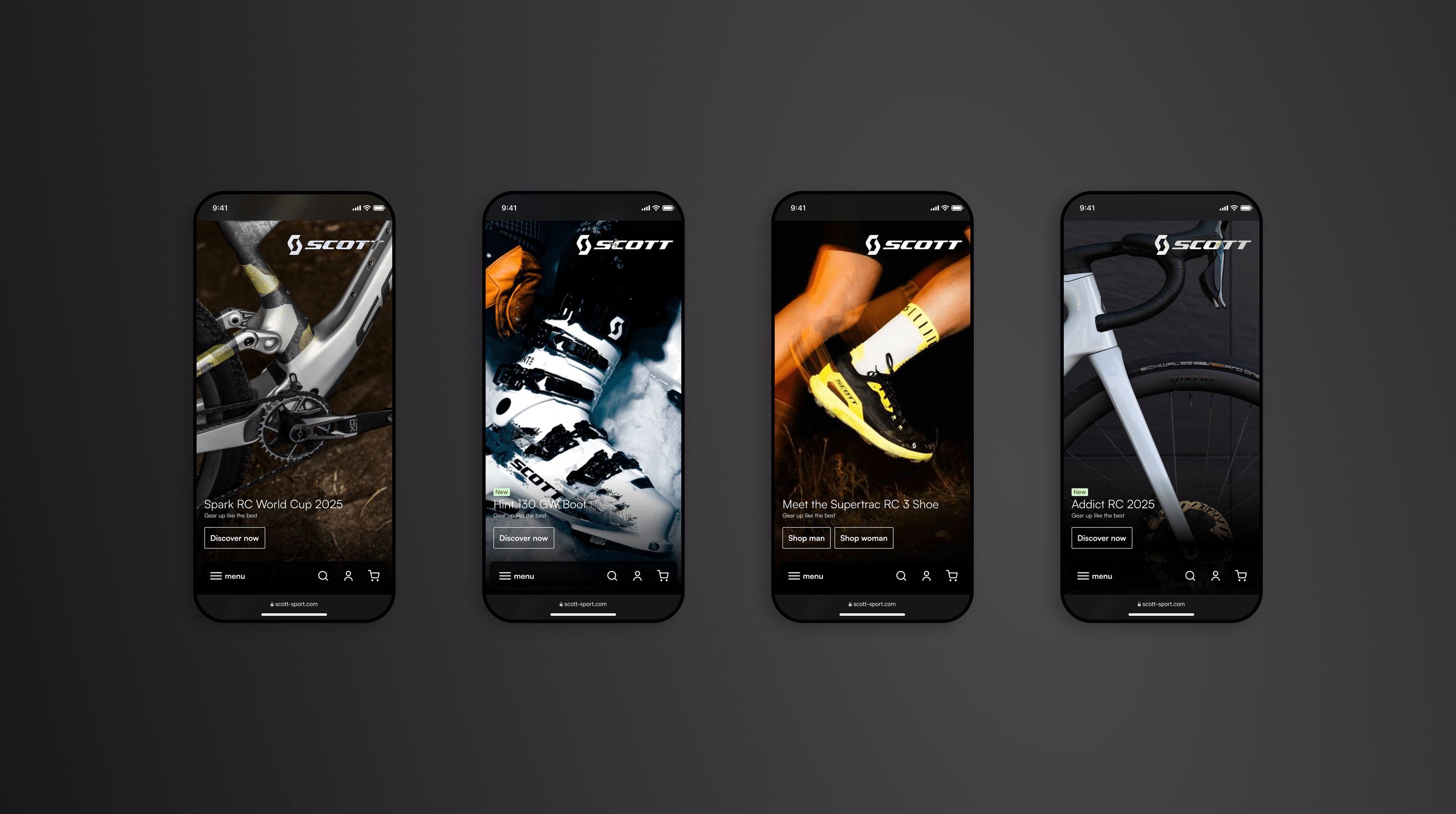
Product pages then run in two modes: a technical view for people who read geometry tables, and a usage view for people who want to know what it’s for. Around them sit a comparator, buying guides, test footage, athlete reviews, bundles, a configurator and 360-degree views. My half was the interface - how all of it looks and holds together, from the dark full-bleed product heroes to the white, functional screens where the choosing actually happens.
This is a proposal. It was designed, prototyped and presented, and nothing has been built from it - so there’s no result to report here yet.
What it argues is that a brand held at arm’s length from its customers can close that distance with the platform itself, by asking who somebody is before it starts selling to them.