Most of the perceived quality of a product lives in the states nobody gets around to designing: hover, focus, loading, error, empty.
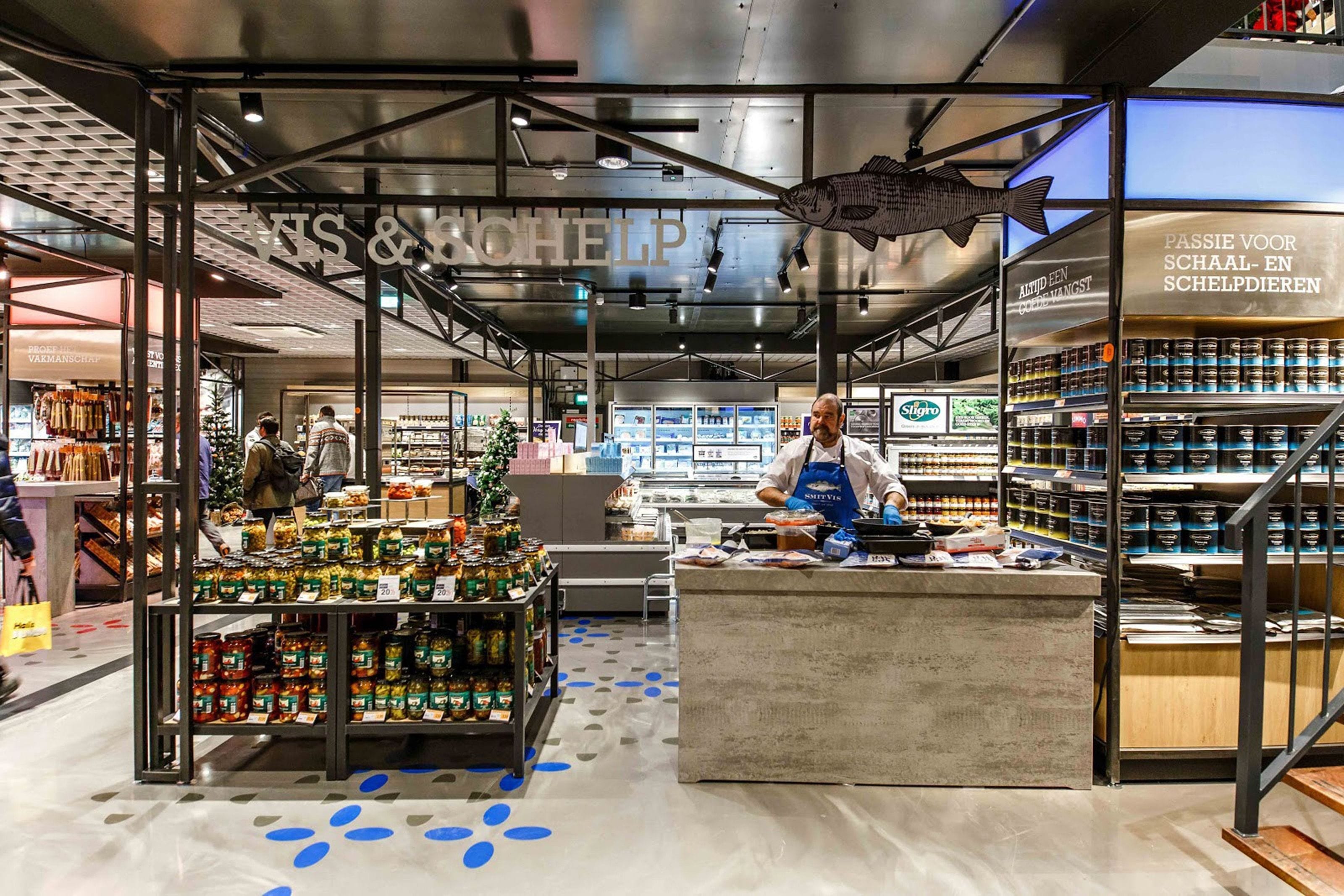
Grid, hierarchy and state, worked out together and then tested against real content rather than the three tidy examples that happen to fit. The account section, cart, checkout and product pages at Kamera Express; the interface for the Scott Sports platform; the UI at Teijin Aramid once the architecture was settled. Most of it sits on a system, which is the point. A screen that cannot be rebuilt from components is a screen somebody will redraw slightly differently next quarter.
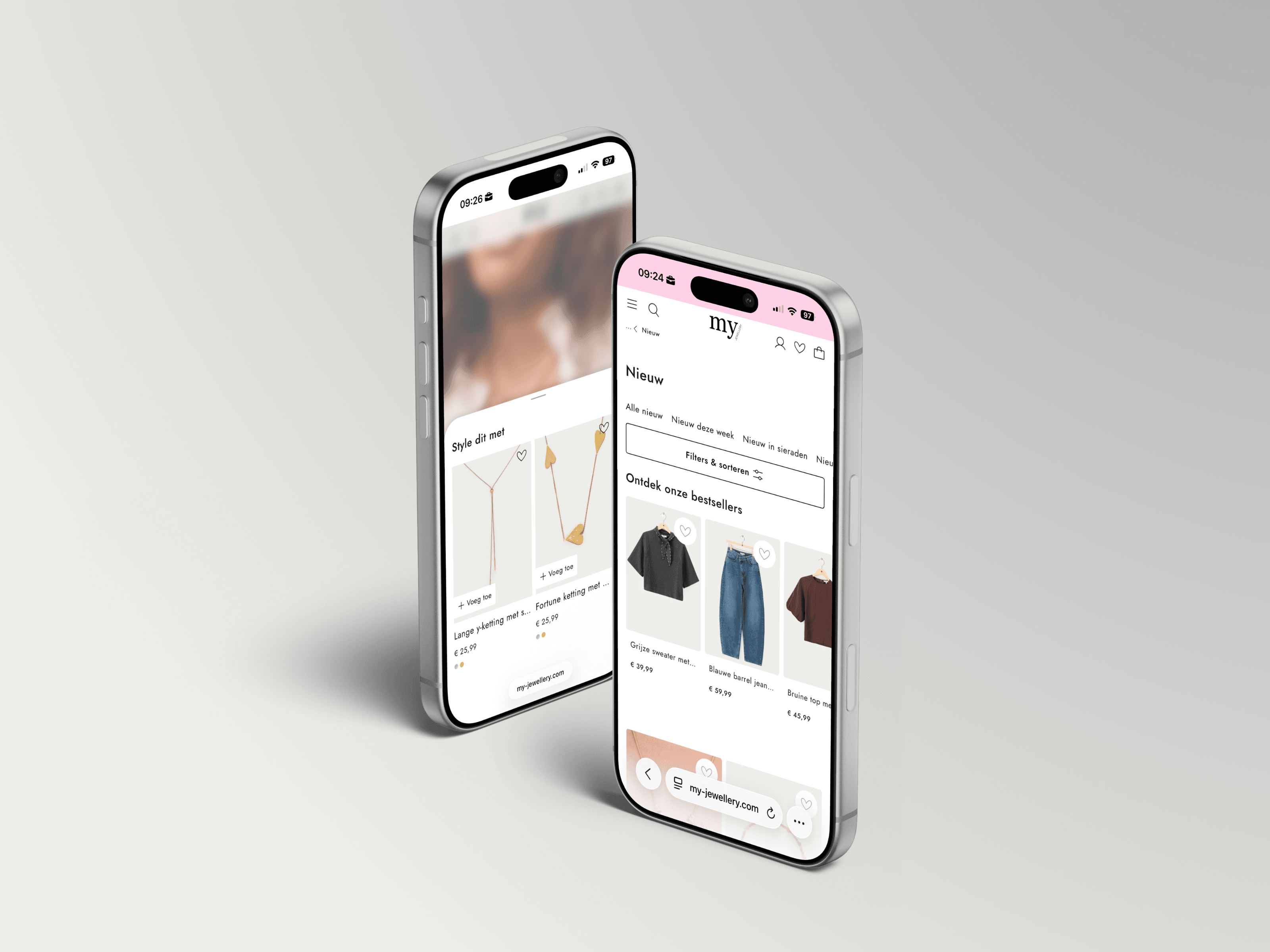
I design in the browser as much as in Figma. Type scales, spacing and states get checked on real devices while the design is still cheap to change, which is why what ships looks like what was approved.
Four steps, run in short loops rather than one long waterfall.
- 01
Frame
Content first: what has to be understood, in what order, on the smallest screen. The grid and type scale follow the content, never the other way around.
- 02
Compose
Layout, colour, imagery and motion brought together into a few strong directions rather than twenty safe ones. A direction is chosen early and taken deep, which is cheaper than keeping five alive.
- 03
Detail
Hover, focus, loading, error and empty states designed on purpose. Most of the perceived quality of a product lives in these states, and most teams never get them.
- 04
Hand over
Specs, tokens and a walkthrough with the developers. I stay available during the build, because the last ten per cent is where an interface either holds together or quietly stops matching what was approved.
The work is mostly decisions about hierarchy: what has to be understood first, on the smallest screen that matters, and what can wait until after it.
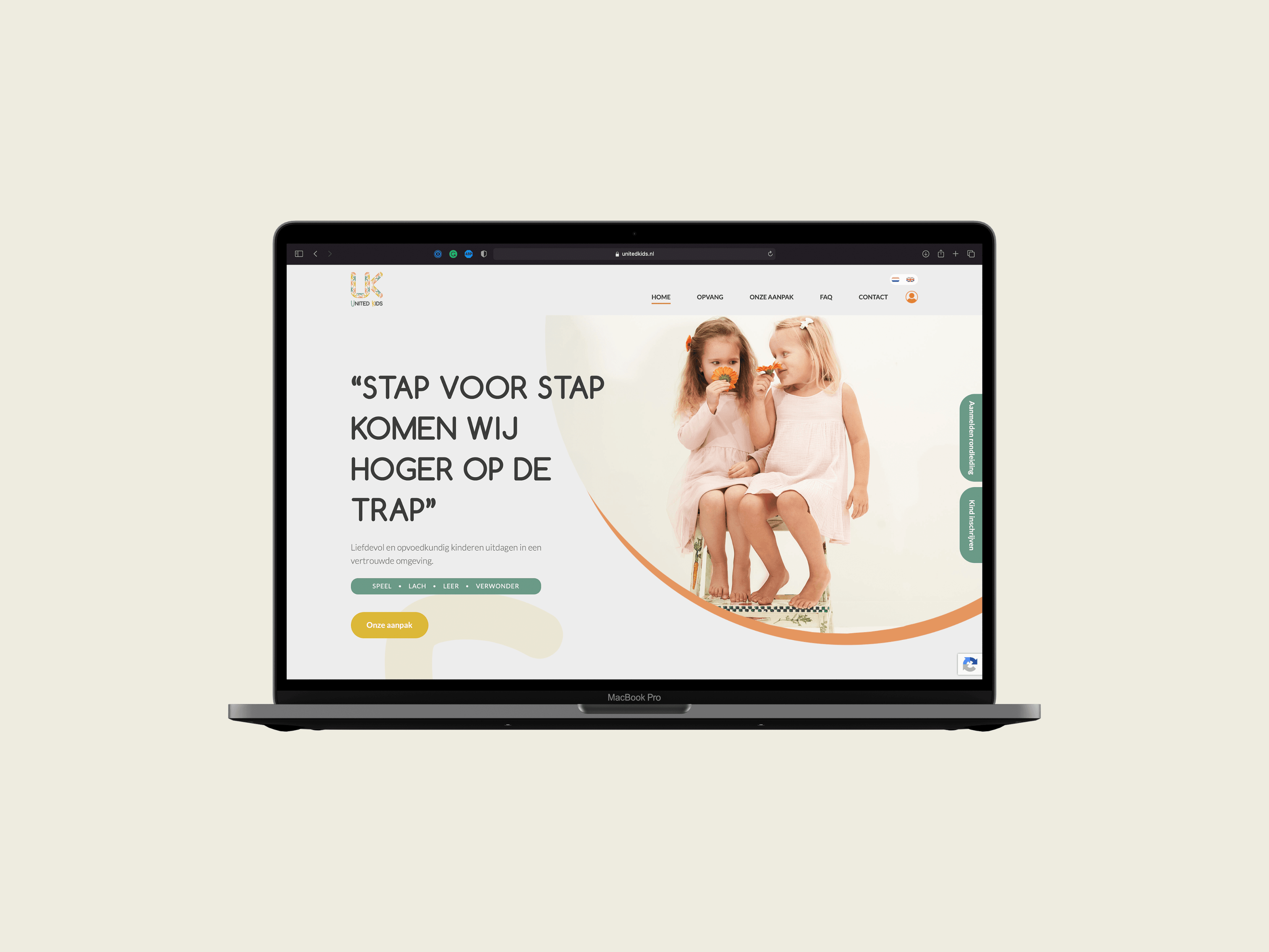
The United Kids site and a dense B2B platform want the same things: clear hierarchy, honest feedback, and no decoration that isn’t doing any work.

Not every project needs all of it. These are the parts.
Layout, colour, type and imagery composed into an interface that carries the brand rather than borrowing a template. The work runs from content outwards: what has to be understood, in what order, on the smallest screen that matters. The grid, the type scale and the imagery are then built to serve that.
Hover, focus, loading, error, empty: every state designed on purpose, with motion that gives feedback rather than decoration. Most of the perceived quality of a product lives in these moments, and most teams never receive them from a designer. They are specified here, so the build has nothing left to invent.
One design language that flexes from a 320px phone to a 4K display: fluid grids, breakpoints and density rules defined once, applied everywhere. I check the design on real devices while it is still cheap to change, so the responsive behaviour is a design decision rather than something discovered during development.
Contrast, keyboard navigation and screen-reader semantics checked against WCAG from the first sketch rather than patched in after launch. Accessible interfaces are simply better interfaces: clearer hierarchy, larger targets, honest feedback. It also keeps European accessibility legislation from becoming an emergency project later.